
J&K · Stain
J&K Hazel Kitchen Cabinets
Available as door style H8 in J&K’s Transitional range
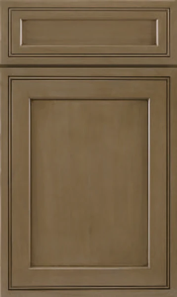
Somewhere between khaki and driftwood — a mid-tone stain with enough gray in it to cool the wood down and enough brown to keep it warm. The grain reads clearly through the color. It suits people who want wood cabinetry without the orange that usually comes attached to it.
- Brand
- J&K
- Finish
- Stain
- Availability
- Made to order
Color & Look
This is a grayed brown rather than a golden one. The stain sits mid-range in value and pulls toward olive, so the door reads closer to weathered timber than to a furniture finish. Grain shows through as darker streaking, more legible here than under a heavier stain, and the profiles around the panel collect extra shadow where the routing turns. There is no glaze on it — the depth comes from the wood itself.
North light emphasises the gray and the olive, and in a cool room this color can look almost gray-green. South and west light warms it into a proper tan, closer to the brown the name suggests. Warm bulbs at night do the same thing. The swing between those two readings is wider than it is for most stains, so looking at a sample in the room at different hours is worth the trouble here.
It is often mistaken for a weathered or wire-brushed oak, though the surface is smooth and the grain finer than oak’s. From a distance it reads simply as gray, then resolves into brown as you approach. Set beside Cinnamon Glazed the distinction is immediate: that finish is amber and orange with a glazed outline, while this one is muted, cooler and even right across the door.
Design & Profile
The interesting thing about this door is that it combines two conventions. The center panel is flat and recessed, as on a shaker, but the frame around it is mitered and molded rather than butt-jointed and plain. Working inward there is a step down from the door face, a narrow flat, then a second smaller step and a fine line before the panel begins. The corners meet on a clean diagonal and the molding runs unbroken around the opening. Rails and stiles are fairly narrow, so the flat panel takes a generous share of the door. The drawer front mirrors it exactly.
That combination is why the door sits comfortably in rooms that cannot quite decide. The flat panel keeps it from reading as period cabinetry, while the mitered, stepped frame gives it more shadow and more craft than a plain shaker carries. It pairs well with square trim and simple crown, and it takes either a knob or a pull without looking wrong. The door is 3/4-inch solid wood and hangs full overlay, and because the molding runs close to the outer edge, a row of these reads as one continuously molded surface rather than a set of separate fronts.
Construction & Quality
J&K builds this cabinetry from 100% solid wood: a 3/4″ solid-wood full-overlay door, drawers of 5/8″ solid wood on all sides in dovetail construction, and a cabinet-grade plywood box with a clear-coated interior. Available as door style H8 in J&K’s Transitional range.
Doors run on 6-way adjustable, soft-close hidden Euro-style hinges, drawers on soft-close concealed undermount glides, and base cabinets carry corner-bracket reinforcements. The finish is hand-rubbed.
Where It Works
A full kitchen in Hazel is a calmer proposition than most stained finishes, because the gray in it lets the wood sit alongside cool counters and gray tile without fighting them. Mid-sized and larger rooms carry it easily, and small ones can too as long as the counter stays light. The transitional door suits a house that is neither strictly modern nor strictly traditional, which describes most houses.
It is a good island color when the perimeter is white, giving the room a wood center that does not shout. In a bath it works on a vanity under a cream or gray top. Laundry, mudroom and office cabinetry all benefit from the mid value, which hides dust and daily marks better than either a pale paint or a near-black stain manages.
Pairing Ideas
Countertops
Cream quartz flatters the olive cast: Cambria Haydon, Notting Hill or Risegate all warm it gently. Cambria Inverness Swansea adds marble-look veining in the same warm family. For more contrast, Cambria Southport keeps the counter bright white, which pushes the gray in the doors forward.
Countertops we carry →Backsplash
Gray tile reinforces the cool side of this stain — MSI Porcelain Tile Eden Bardiglio or Gray Praia both do that cleanly. If you would rather warm the room back up, MSI Soreno Taupe Porcelain and Taja Perla sit in the cream range and soften the olive. Sand Veneto is the middle path between the two.
Backsplash tile →Hardware
Black is the crispest answer on a grayed wood — the Berenson Metro 160mm Matte Black Pull reads clearly against the mid tone. Brushed nickel is quieter and holds the cool undertone. Brushed gold or champagne warms the olive noticeably, which is the right move if everything else in the room is running cool.
Pulls & knobs →Floors
Because the doors are mid-toned, the floor should go lighter or darker to avoid a near-match that looks unintentional. Pale oak keeps the room airy. A darker walnut-toned hardwood grounds it. Gray LVP or porcelain tile pushes the whole scheme cool and works particularly well with the olive cast in the stain.
Flooring →Frequently Asked Questions


Plan a Kitchen in Hazel
Tell us about your room and we will help you decide whether Hazel is the right call, then design, order and install it.
Or call: (630) 733-7700