
J&K · Stain
J&K Java Coffee Kitchen Cabinets
Available as door style S1 in J&K’s Contemporary range
Dark enough to read almost black across a room, then clearly brown once you are standing at the counter. Java Coffee is a deep chocolate stain that still lets the grain show through, so it has movement paint cannot give. It suits kitchens with light to spare and owners who want weight rather than brightness.
- Brand
- J&K
- Finish
- Stain
- Availability
- Made to order
Color & Look
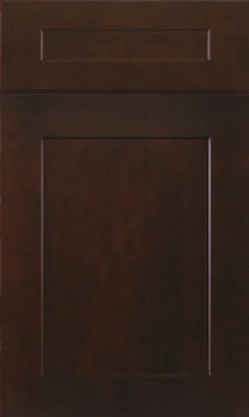
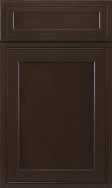
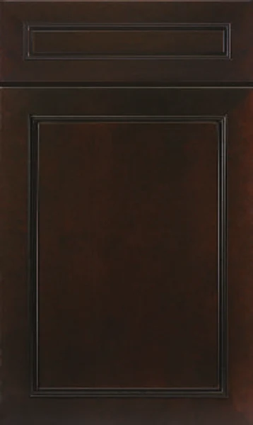
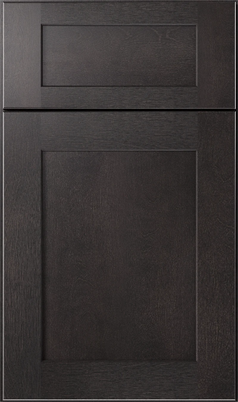
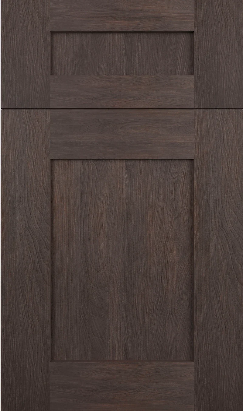
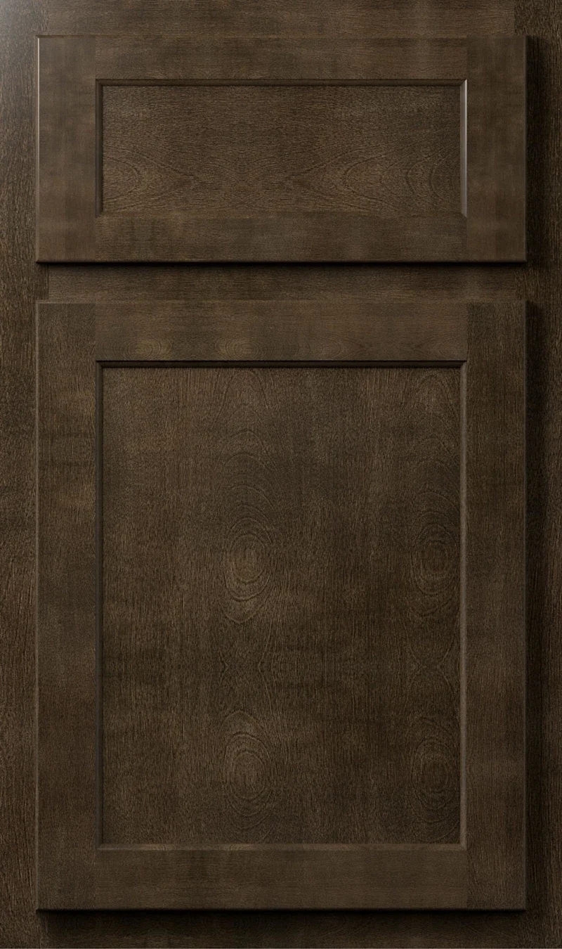
The stain goes on heavy — deep enough that from the doorway the doors read as one dark mass. Up close it resolves into brown with a red-tinged warmth, not the cold blue-black of a lacquered finish. Grain stays legible underneath, running as darker streaks and small figure across the center panel. On the flat shaker face, light skims the surface and the bevel around the panel picks out a thin bright line at the perimeter.
In a south-facing kitchen this is a rich, warm brown and the red core is easy to see. Under north light it flattens toward black-brown, the grain becomes harder to read, and the doors gain weight while losing detail. At night under warm bulbs it lands somewhere between the two, catching highlights along the rails and edges. A dark stain absorbs light rather than returning it, so the light a room already has matters more here than with any pale color.
Most people call it espresso on sight, and the brand does list an Espresso alongside it — the two are close enough that we would put the samples side by side rather than choose from names. What separates Java Coffee from a painted black is the grain: it reads through the stain and gives the door a softness lacquer cannot. It is also warmer than it first appears, which matters when you set it against a cool gray counter.
Design & Profile
This is a plain shaker frame, and the depth of the finish makes the geometry easy to read. The panel is flat and recessed, and the chamfer around the opening picks up a thin lighter line down the left stile and across the top rail, where the angled face turns toward the light. Grain runs vertically through the panel and carries on up the stiles. Rails and stiles are close to even, and all four corners of the opening are square butt joints. The drawer front repeats the idea in miniature: a slab with a shallow routed rectangle, square corners, and a wide flat border around it.
The value of a low-relief door is that it keeps its edges. Nothing on this face is deep enough to trap shadow, so what defines each door is the thin bright line at the chamfer and the seams between the doors, and the profile stays legible from across a room. That makes it a good base for hardware with some presence, since the door itself offers no competing detail. Every J&K door is 3/4-inch solid wood hung full overlay, and the panel on the S styles is an all-wood reversed raised panel, with its raised face turned inward.
Construction & Quality
J&K builds this cabinetry from 100% solid wood: a 3/4″ solid-wood full-overlay door, drawers of 5/8″ solid wood on all sides in dovetail construction, and a cabinet-grade plywood box with a clear-coated interior. Available as door style S1 in J&K’s Contemporary range.
Doors run on 6-way adjustable, soft-close hidden Euro-style hinges, drawers on soft-close concealed undermount glides, and base cabinets carry corner-bracket reinforcements. The finish is hand-rubbed.
Where It Works
A kitchen finished entirely in this stain needs light to carry it. With large windows and a white counter it looks deliberate and calm. In a smaller or darker room we would use it on the island alone, or on the lowers with something pale above, so the depth sits where it does the least harm to the sightline. It reads transitional or contemporary depending on what surrounds it; the flat door keeps it from looking period.
Elsewhere in the house it is far easier to commit to. A dark vanity in a powder room is a good use of a color that would be heavy across a whole kitchen. The same goes for a bar, a study wall of cabinetry, or a mudroom run where the depth hides everyday wear. In a laundry room, pair it with a light counter so the working surface stays easy to see.
Pairing Ideas
Countertops
Contrast is the point here. Cambria Salt Lake or Portrush keep the top bright and unbusy against so much dark wood. Cambria Inverness Everleigh adds marble-look veining if you want the counter to be the feature of the room. For a warmer scheme, MSI Monte Cristo granite brings cream with veining that answers the brown.
Countertops we carry →Backsplash
A light wall keeps the room from closing in. MSI Glacier Statuary Panels give a near-seamless white surface with very little grout to break it up. If you would rather the backsplash sat between the cabinets and the counter in value, MSI Pietra Grigio or Cement Ash Matte bring gray that softens the jump from dark doors to white stone.
Backsplash tile →Hardware
Metal has to be visible against a stain this dark. Brushed nickel, in the Berenson Bravo 56mm pull, reads clearly and stays neutral. Brushed gold or the Champagne Bar Pull warms the brown and is the more striking choice. Matte black effectively disappears at a distance, so use it only when you want hardware that vanishes.
Pulls & knobs →Floors
Avoid matching the floor to the doors, or the room loses its footing. A mid-tone engineered hardwood a few shades lighter gives the separation you need. Pale oak or a light LVP plank makes the strongest contrast and keeps the space open. Porcelain tile in a warm gray works when the floor should stay neutral and let the cabinets lead.
Flooring →Frequently Asked Questions

Plan a Kitchen in Java Coffee
Tell us about your room and we will help you decide whether Java Coffee is the right call, then design, order and install it.
Or call: (630) 733-7700