
J&K · Paint
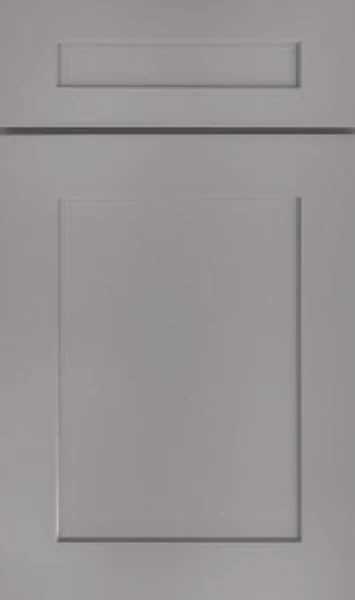
J&K Castle Grey Kitchen Cabinets
Available as door style S5 in J&K’s Contemporary range
Gray without an agenda: no blue pulling it cool, no brown warming it up. Castle Gray sits near the middle of the value range, dark enough to hold its own against a white counter and light enough that a full kitchen never feels heavy. A good choice when you want color that stays quiet.
- Brand
- J&K
- Finish
- Paint
- Availability
- Made to order
Color & Look
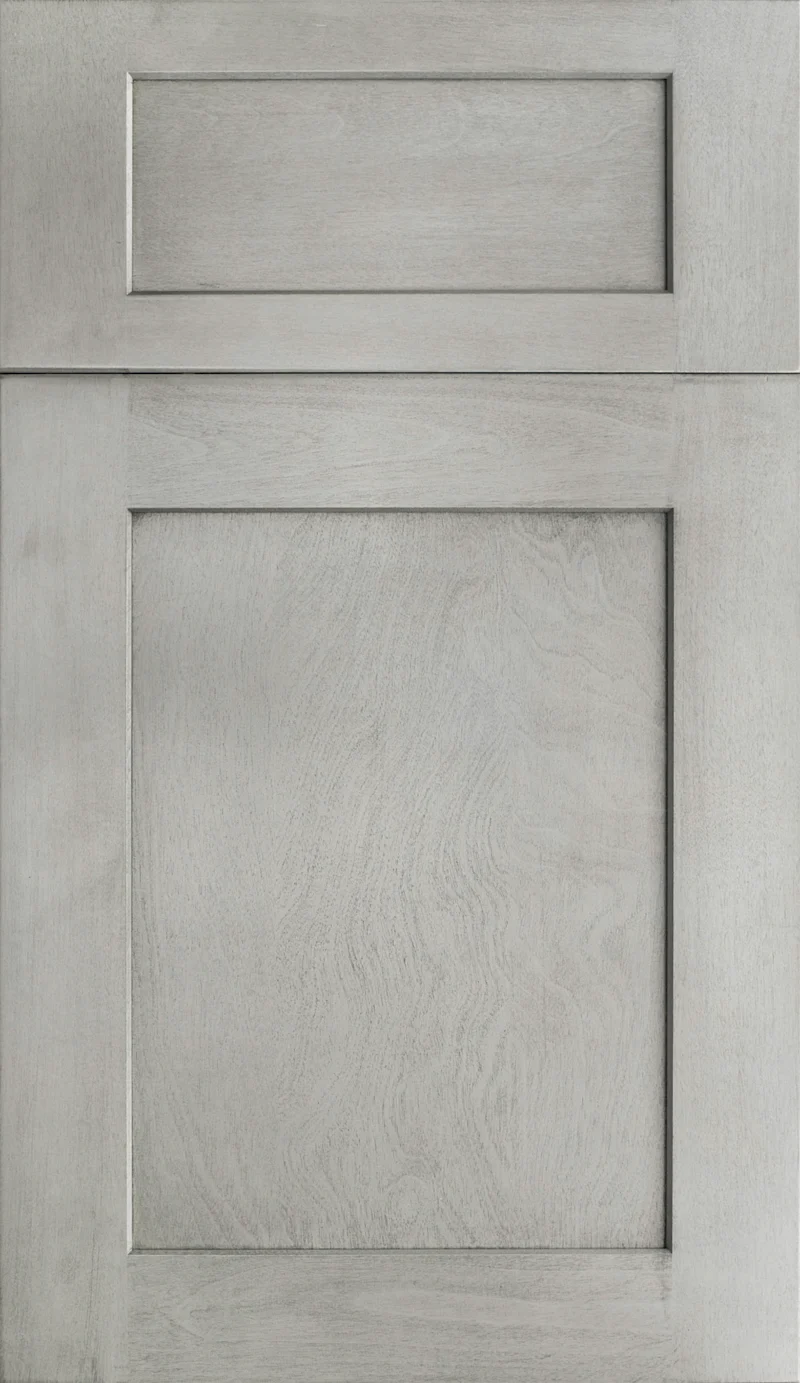
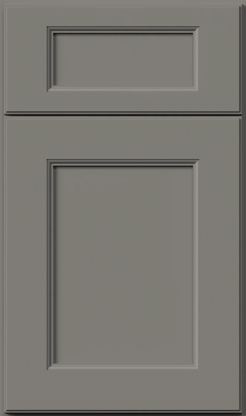
This one is genuinely neutral, which is rarer than it sounds. Most cabinet grays lean blue or drift toward greige; hold this against a white card and neither happens. It lands close to the midpoint between white and charcoal, so it has real weight across a wall of uppers. The paint is flat, opaque and sanded smooth over solid wood, with the only shadow on the door coming from the bevel around the recessed panel.
Because there is so little pigment bias, it takes on whatever the room gives it. Under north light it cools noticeably and can look almost stony, closer to concrete than to paint. South and west exposure warms it, and in late sun the flat panel picks up a faint putty cast. Warm bulbs at night make it softer and a shade deeper than most people expect. Look at it lit the way your kitchen is lit, not under a single bright overhead.
It gets confused with the storm-gray and blue-gray paints that have been common for years, and it is neither of those. There is no blue in it at all. It is also not a greige — the brand’s Greige carries an obvious brown that this color lacks, and set side by side the difference reads instantly. What Castle Gray does share with those finishes is tolerance for daily life: a mid-tone paint is the most forgiving value there is on a cabinet door.
Design & Profile
This is a plain shaker frame around a flat recessed panel, and what stands out is how little relief it has. The panel drops only slightly below the rails and stiles, and the small chamfer around the opening is shallow enough to read as a soft shadow rather than a drawn line. Rails and stiles are cut close to even, so no one edge of the frame dominates. Corners are square butt joints throughout, with no miter and no applied molding. The drawer front above is a flat slab with a shallow rectangle routed into its face, square at every corner and set inside a wide, uninterrupted margin.
A profile this restrained does most of its work through repetition. Because there is almost nothing on the face to cast a shadow, a run of these doors reads as a series of flat planes separated by thin seams, and the shape of the kitchen carries the room rather than the doors themselves. That makes it an easy partner for busy counters and open shelving. Each door is 3/4-inch solid wood hung full overlay, and the center panel on the S styles is an all-wood reversed raised panel, which is what keeps the visible face flat and unbroken.
Construction & Quality
J&K builds this cabinetry from 100% solid wood: a 3/4″ solid-wood full-overlay door, drawers of 5/8″ solid wood on all sides in dovetail construction, and a cabinet-grade plywood box with a clear-coated interior. Available as door style S5 in J&K’s Contemporary range.
Doors run on 6-way adjustable, soft-close hidden Euro-style hinges, drawers on soft-close concealed undermount glides, and base cabinets carry corner-bracket reinforcements. The finish is hand-rubbed.
Where It Works
A whole kitchen in a mid gray works best where there is decent daylight, since the color absorbs more light than it returns. In a bright room it looks handsome across every run. In a darker one we would more often put it on the base cabinets and island and keep the uppers white or off-white, which holds the weight low and keeps the sightline light. The flat shaker door keeps the effect contemporary rather than period.
Outside the kitchen it is one of the most useful colors in the range. A gray vanity takes daily use without showing it. Laundry and mudroom cabinets in this tone hide the marks that come with the job. It also suits a bar or a home office, where you want the cabinetry to feel built in and recessive, particularly against a warm wood floor that supplies the contrast the color itself does not.
Pairing Ideas
Countertops
White quartz is the obvious counterweight and it does the job. Cambria Ironsbridge or Highgate keep the top clean and near-solid; Torquay or Brittanicca add marble-look veining that lifts the gray. If you would rather warm the scheme, Cambria Everleigh Warm brings a cream cast that softens the whole room.
Countertops we carry →Backsplash
Run the wall lighter than the doors. MSI Carrara White Milano Ribbo 12x24 gives a ribbed white that adds texture without adding color, and Eden Statuary White is the quieter flat option. For warmth against a neutral gray, Pietra Bernini Camo Porcelain brings cream that keeps the room from reading entirely cool.
Backsplash tile →Hardware
Matte black is the sharpest pairing — the Berenson Metro 160mm pull draws clean lines across a gray front. Brushed gold, in the Swagger 96mm Modern Brushed Gold Pull, warms the neutral and is the more current look. The Epoch Edge 128mm Vintage Nickel Pull sits between the two if you want hardware that does not announce itself.
Pulls & knobs →Floors
Warm wood is the best partner, since the cabinets bring none of their own warmth. Engineered hardwood in an oak tone grounds the room. If you want a cooler, all-of-a-piece scheme, large-format porcelain in a pale gray extends the palette. LVP in a light plank is the practical middle ground for a house with dogs and children.
Flooring →Frequently Asked Questions



Plan a Kitchen in Castle Grey
Tell us about your room and we will help you decide whether Castle Grey is the right call, then design, order and install it.
Or call: (630) 733-7700