
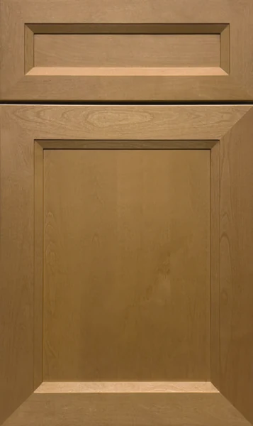
J&K · Stain
J&K Butterscotch Kitchen Cabinets
Available as door style B8 in J&K’s Transitional range
Warm, golden and unmistakably wood, Butterscotch is a medium stain that lets the grain read across every door. It is the color most people mean when they say honey or caramel cabinets. It suits kitchens where wood is meant to be seen as wood, and it sits easily in traditional and craftsman-leaning rooms.
- Brand
- J&K
- Finish
- Stain
- Availability
- Made to order
Color & Look
Value sits in the middle — well lighter than a dark brown stain, and dark enough that it is clearly a stained cabinet rather than a natural one. The color is a warm gold-brown with genuine saturation; there is orange in it, and no gray holding it back. On the B8 door the stain lies fairly evenly, going deeper where the panel edge slopes back toward the frame and along the profiled inner edge, which is where the door gets most of its definition.
Grain is the main event. The wood shows arched cathedral figure across the panel and straighter lines through the rails and stiles, and the stain settles into the open grain so the pattern reads as darker streaking against the gold ground. Because this is a stain and not a paint, no two doors are identical — figure varies from board to board, and that variation is normal rather than a flaw. It is better expected than discovered after delivery.
North light takes some of the heat out of it and the color reads closer to a mid honey. South and west sun does the opposite — late afternoon light pushes it toward orange, which is the single most common complaint about golden stains and the reason we suggest looking at a sample in the actual kitchen at that hour. Under warm bulbs it glows; under cool white LEDs it reads more tan and less yellow. The sheen is low, with no gloss to it.
Design & Profile
The frame breaks at its inner edge into a wide shoulder that slopes down and inward to a flat center field. It is a generous slope, so the field sits noticeably below the plane of the frame, and the shoulder miters at all four corners into short, clean diagonals. Rails and stiles are even and wide, and the opening is square. The drawer front carries the same profile shrunk to a long shallow recess, sloped on all four sides, with the miters plainly visible at each end.
The depth is what we think makes this door work at a distance: the slope gives the face three changes of plane before you reach the center, so there is always some structure for the eye to settle on. The center panel on the S and B styles is an all-wood reversed raised panel, which is why the shoulder slopes inward rather than standing proud. The door is 3/4-inch solid wood hung full overlay, and across a long run the mitered corners line up from front to front.
Construction & Quality
J&K builds this cabinetry from 100% solid wood: a 3/4″ solid-wood full-overlay door, drawers of 5/8″ solid wood on all sides in dovetail construction, and a cabinet-grade plywood box with a clear-coated interior. Available as door style B8 in J&K’s Transitional range.
Doors run on 6-way adjustable, soft-close hidden Euro-style hinges, drawers on soft-close concealed undermount glides, and base cabinets carry corner-bracket reinforcements. The finish is hand-rubbed.
Where It Works
A full kitchen in Butterscotch is a warm, settled room, and it works best with cream or white counters that keep it from becoming monotone. It is also a good match for a house that already has oak trim or a wood floor with gold in it — instead of fighting the existing wood, it joins it. Traditional, craftsman and transitional kitchens all take it. In a cool, minimal room it will look out of place.
On an island with painted perimeter cabinets, this is a way to bring wood into a kitchen without committing the whole room to it. Beyond the kitchen it suits a basement bar, a den or an office where a warm wall of cabinetry feels right. In a bath it works on a vanity with white tile above. Laundry and mudroom use is fine, though a stained door shows water spots more readily than a painted one.
Pairing Ideas
Countertops
Cool white counters balance the gold — Vicostone Delicato, Vicostone Valley White and Vicostone Esmeralda, all near-solid bright whites, keep the wood as the main event. Vicostone Calacatta Caldia adds marble-look veining if you want movement overhead. If you prefer a warmer room, Cambria Hawkridge in cream or Cambria Halewood with its veining will lean into the gold rather than cut against it.
Countertops we carry →Backsplash
Keep the wall pale so the wood has somewhere to breathe. MSI Whisper White subway is the simplest answer and it never fights the grain. For texture, MSI Bianco Dolomite Alana Polished and MSI Arabescato Venato White Picket Honed are white mosaics with enough pattern to hold interest. MSI Alaska Gray Pebble Polished is the cooler option and it tempers the warmth noticeably.
Backsplash tile →Hardware
Bronze and darker warm metals are the traditional match — Berenson Swagger 160mm MDB in bronze sits in the same family as the stain and reads as part of the door. For contrast, the Berenson Metro 160mm Matte Black Pull draws a crisp outline that keeps a golden kitchen from looking like a period piece. Brushed nickel, such as Berenson Bravo 56mm, cools the scheme when the counters are white.
Pulls & knobs →Floors
Matching the floor to the cabinets is the usual mistake — a wood floor in the same gold tone turns the lower half of the room into one continuous surface. Go lighter with a pale engineered hardwood, or considerably darker. Gray-toned LVP or porcelain tile gives the strongest separation and is the more current answer. Cream porcelain or ceramic tile is the softer one.
Flooring →Frequently Asked Questions


Plan a Kitchen in Butterscotch
Tell us about your room and we will help you decide whether Butterscotch is the right call, then design, order and install it.
Or call: (630) 733-7700