
Mantra · Paint
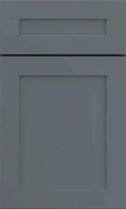
Mantra Graphite Kitchen Cabinets
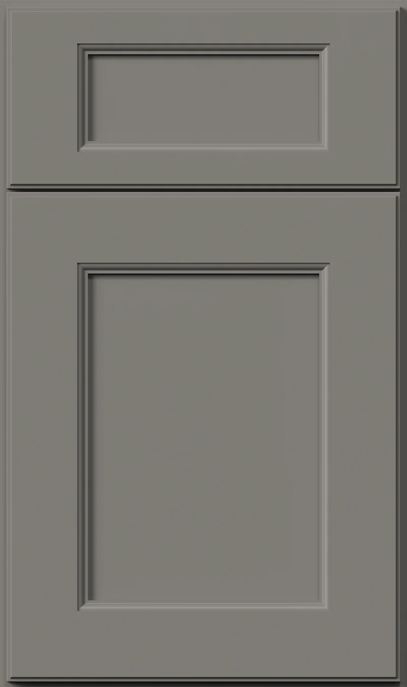
Available on the Omni door
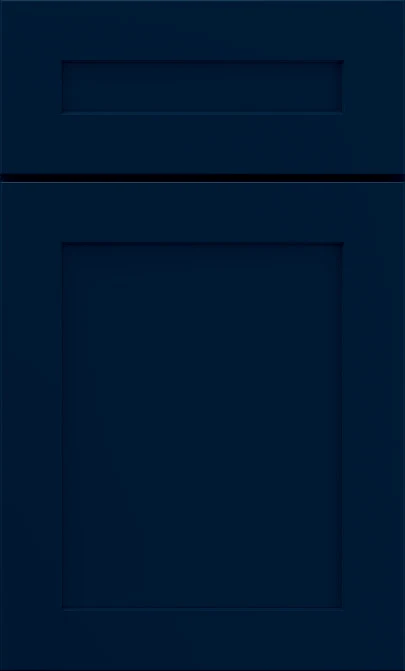
A charcoal cooled with blue instead of warmed with brown — that is where Graphite sits. It is dark enough to anchor a kitchen but a long way short of black, and the blue in it keeps the color from going flat under artificial light. Give it some daylight and it earns its place.
- Brand
- Mantra
- Finish
- Paint
- Availability
- Made to order
Color & Look
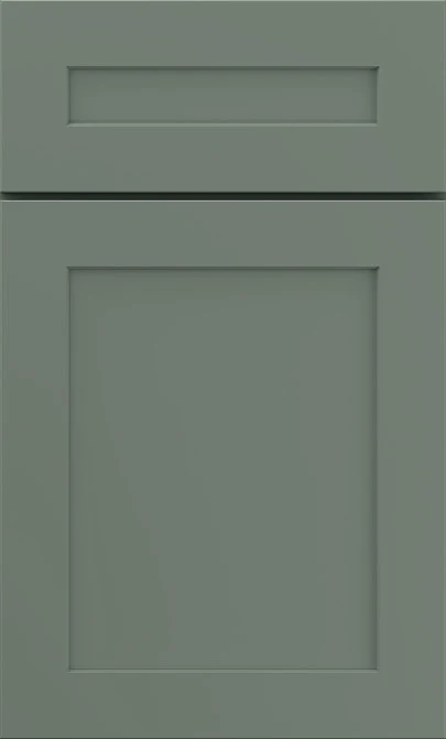
On the value scale Graphite lands at the darker end of mid, which matters more than the hue does. It is a color you can use on wall cabinets without the room closing up, unlike a true black. The hue underneath is a clear cool blue, the slate end of gray rather than the smoke end. On the Omni door the shadow line around the recessed panel does more work than it does on a pale color, because on a dark field that thin line is the main thing describing the door’s shape.
Cool northern daylight brings the blue right out, and Graphite can look close to a dark denim on a gray morning. Strong sun flattens it toward a plain charcoal and lifts the surface a half-step. Warm bulbs neutralize most of the blue after dark, which is worth knowing if you cook at night — the kitchen you see in the evening is grayer and heavier than the one in your morning photographs. Under mixed lighting it moves between the two.
Photographs make Graphite look black, and it is not. Put it beside a matte black pull and the pull reads as the darker object every time, with the cabinets sitting clearly lighter and bluer behind it. That relationship is the quickest way to judge it in person. The paint is smooth and opaque with a low sheen; dark low-sheen finishes hold fingerprints and dust more visibly than pale ones, which is the honest trade-off with any color at this value.
Construction & Quality
Mantra is part of the MasterBrand family and is built on plywood construction — ½″ plywood ends and ¾″ plywood adjustable shelves — with a solid-wood dovetail drawer box. Available on the Omni door.
Doors and drawers are soft-closing as standard, on 6-way adjustable hinges and under-mount full-extension guides. Mantra is ICC-ES certified to ANSI A161.1 and carries a limited 5-year warranty.
Where It Works
The common use is the lower half of the kitchen — base cabinets, island, a run of tall pantry units — with something light above. That split keeps the room bright and puts the weight where cabinets take the most abuse anyway. A full Graphite kitchen is possible and looks very composed, but it wants real daylight and a light countertop and backsplash to balance it. In a small kitchen with one window we would keep it to the island and let the perimeter stay pale.
The color suits transitional and modern rooms most naturally, and it looks settled on a plain shaker door where the dark field and the square frame do all the work. It is also a good bath vanity color, especially in a powder room where a dark cabinet feels intentional rather than heavy. A bar, a media wall or an office wall of cabinets in Graphite reads more like furniture than millwork, which is usually the point.
Pairing Ideas
Countertops
Bright white quartz gives you the cleanest break. Vicostone Pure White or Michelangelo are near-solid and keep the line between counter and cabinet razor sharp. Vicostone Carrara brings gray veining that echoes the cabinets and softens the transition. Vicostone Acacia in cream is the warmer alternative when a stark white feels too severe against the blue.
Countertops we carry →Backsplash
White is the usual answer and there is a reason for it — MSI Glossy White or Dymo Calacatta White 12x24 Glossy both throw light back at a dark lower run. If you want more character, Greta Encaustic adds pattern in white while keeping the wall bright. Kenzzi Dekora Encaustic in cream warms the scheme if the blue reads too cold for you.
Backsplash tile →Hardware
Nickel is the most legible choice on a dark door. The Berenson Bravo brushed nickel or the Epoch Edge vintage nickel both hold a visible line against the charcoal. Champagne or brushed gold gives you a warm contrast that plays against the blue undertone. Matte black nearly disappears, which some people want and others regret.
Pulls & knobs →Floors
Light and mid-tone floors carry Graphite best, since matching a dark floor to dark cabinets removes the contrast that makes the color work. A warm oak floor offsets the blue. A gray LVP reinforces it and reads more modern. Porcelain tile in a light stone look is the practical option for a mudroom or bath in the same color.
Flooring →Frequently Asked Questions



Plan a Kitchen in Graphite
Tell us about your room and we will help you decide whether Graphite is the right call, then design, order and install it.
Or call: (630) 733-7700