
Mantra · Paint
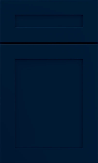
Mantra Admiral Kitchen Cabinets
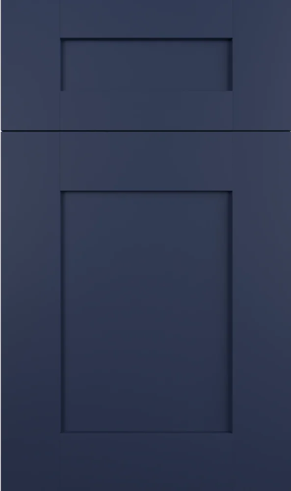
Available on the Omni door
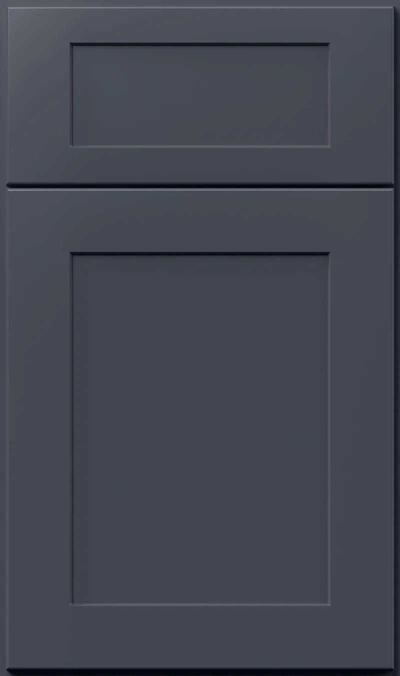
Navy is a color most people either commit to or avoid, and Admiral sits at the deep end of it. This is a dark, saturated blue that reads almost black in shadow and only shows its color where light lands. Used well it gives a kitchen the weight that paler schemes never quite find.
- Brand
- Mantra
- Finish
- Paint
- Availability
- Made to order
Color & Look
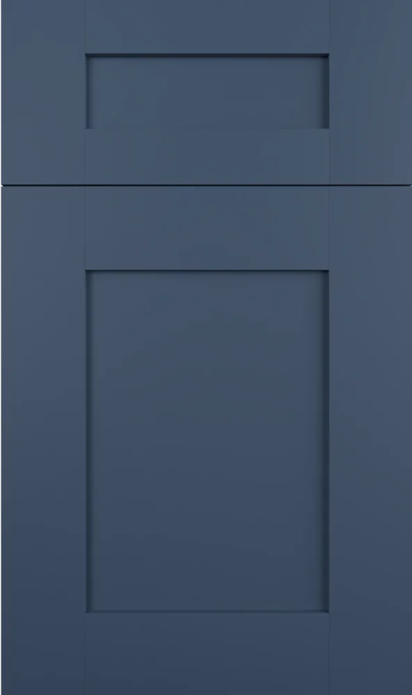
The value here is very low — this is among the darkest finishes you will see on a painted door, and the blue underneath it is strongly saturated, which is what keeps it from being simply black. On the Omni sample the effect is unusual: the shadow line around the recessed panel almost vanishes because there is so little contrast left at this depth, and the door’s shape is carried instead by the way the sheen catches across the frame.
Light dictates everything with a color this dark. Direct daylight is when Admiral looks navy, deep and clearly blue, and it is the version people fall in love with in a showroom. A few feet from the window that color collapses into near-black, and in a north-facing kitchen on a gray day it will read black for most of the morning. Warm bulbs in the evening take the blue down further. Judge it where the cabinets will actually stand.
Photographs flatter it, usually showing a brighter mid-navy that does not exist in the room, and that mismatch is the most common surprise we head off. Held next to black hardware, Admiral is clearly the blue object, which is a useful test. The finish is smooth and opaque with a low sheen. As with any very dark cabinet, dust along the top edges and fingerprints around the pulls show more than they would on a light door.
Construction & Quality
Mantra is part of the MasterBrand family and is built on plywood construction — ½″ plywood ends and ¾″ plywood adjustable shelves — with a solid-wood dovetail drawer box. Available on the Omni door.
Doors and drawers are soft-closing as standard, on 6-way adjustable hinges and under-mount full-extension guides. Mantra is ICC-ES certified to ANSI A161.1 and carries a limited 5-year warranty.
Where It Works
Base cabinets and islands are where Admiral does its best work — the weight sits low, the color stays near your sight line, and a white countertop above gives it the break it needs. A full Admiral kitchen is a real option in a room with big windows and pale surfaces, and it can look like a library in the best sense, but it is not a choice for a small kitchen with a single north window. In that room we would use it on the island only.
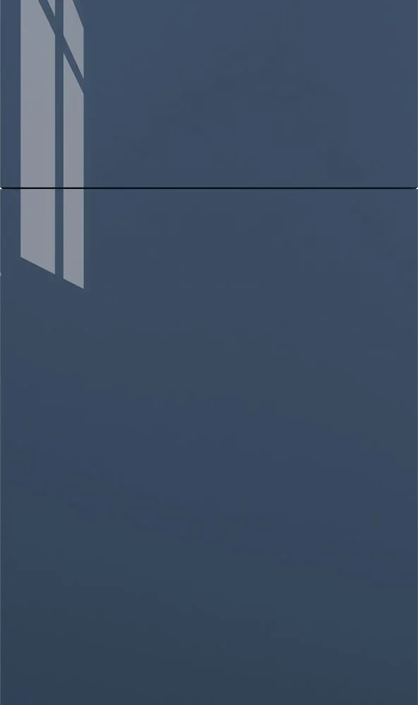
The color reads traditional on a paneled door and thoroughly modern on a plain one, which is part of its appeal. Outside the kitchen it is a strong pick for a powder room vanity, where a dark cabinet in a small space feels considered rather than cramped, and for a bar or butler’s pantry meant to contrast with a lighter kitchen. In an office it gives built-ins the look of furniture, provided there is a lamp or two to keep the blue alive.
Pairing Ideas
Countertops
Bright white is the pairing that makes Admiral sing, and near-solid slabs keep the edge crisp. Vicostone whites such as Forza, Costa Nova or Akoya all hold a clean line against the navy. Cambria Lincolnshire in cream with marble-look veining is the softer route, warming the contrast rather than sharpening it.
Countertops we carry →Backsplash
A gray mosaic bridges the gap between navy cabinets and a white counter. MSI Renzo Storm Picket and Metro Gris Blend Interlocking both do that without adding another color. For maximum brightness, Penny Round Bianco 6mm Matte in white keeps the wall reflective. Kenzzi Indigo Encaustic picks up the blue directly if you want the theme carried onto the wall.
Backsplash tile →Hardware
Warm metal against deep navy is a long-standing pairing for good reason. The Berenson Champagne Bar Pull or the Swagger brushed gold both read clearly and lift the color. Brushed nickel is the cooler, quieter alternative and still stays visible. Matte black effectively disappears into the door, so choose it only if you want the hardware to go unnoticed.
Pulls & knobs →Floors
Light floors do the most for Admiral, because the contrast is what tells you the cabinets are blue rather than black. A pale or mid oak, in solid or engineered, is the usual pairing. Very dark flooring will swallow the base cabinets entirely. In a powder room or bar, light porcelain tile keeps a dark vanity from feeling like a hole in the floor.
Flooring →Frequently Asked Questions


Plan a Kitchen in Admiral
Tell us about your room and we will help you decide whether Admiral is the right call, then design, order and install it.
Or call: (630) 733-7700