

Kemper · Paint
Kemper Icy Avalanche Kitchen Cabinets
Offered in the Kemper Echo, Choice and Emerge series
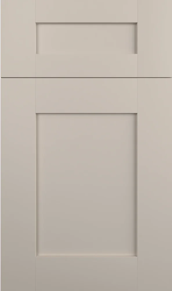
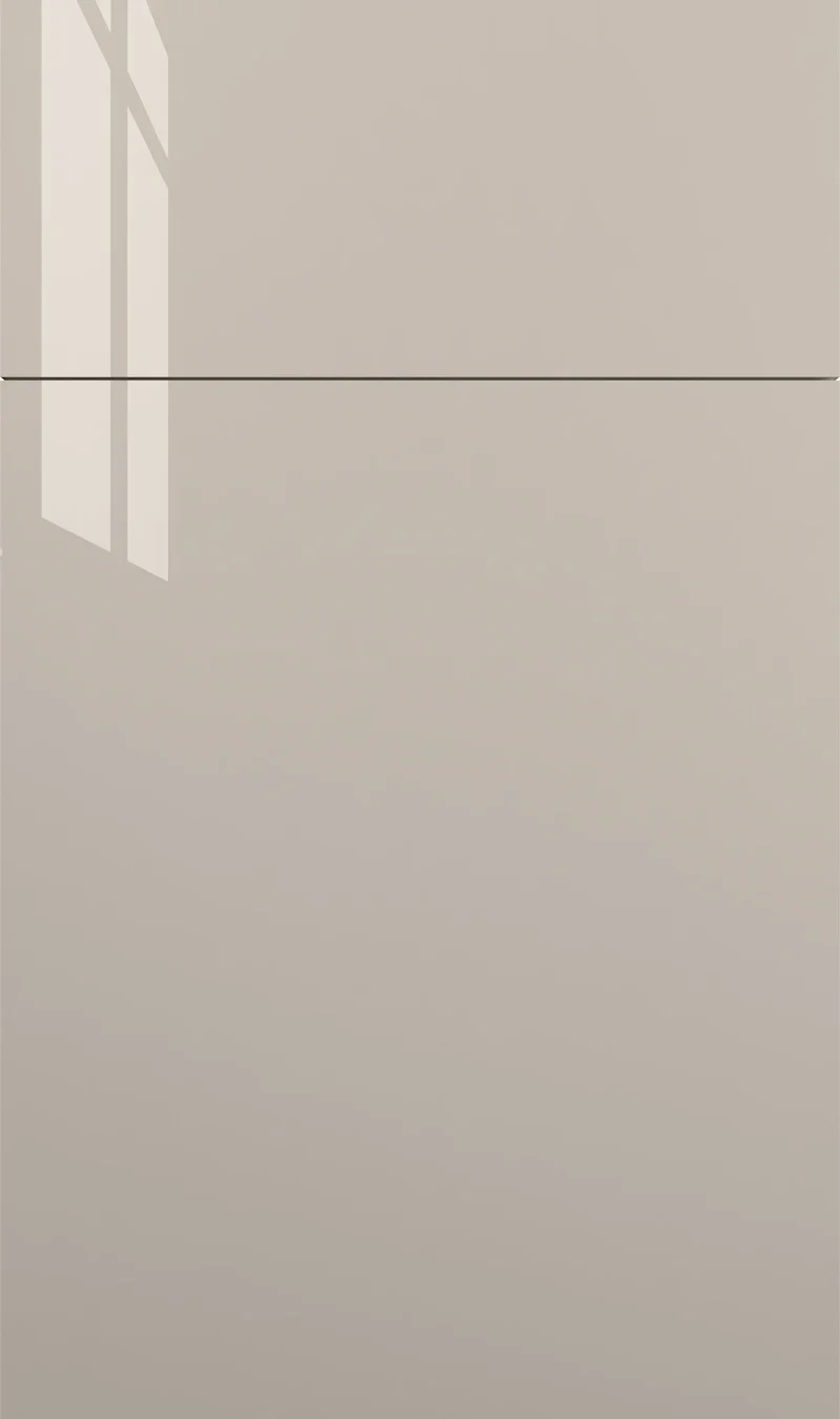
Light, quiet and very slightly green, Icy Avalanche is the kind of greige that does most of its work without being noticed. It stays close to white in a bright room and drifts toward soft gray in a dim one. Good for kitchens that want a neutral with a little more life than plain white.
- Brand
- Kemper
- Finish
- Paint
- Availability
- Made to order
Color & Look
The chip is high in value — only a step off white — with very low saturation and a hue that leans just far enough toward green-yellow to keep it from feeling cold. Call it a pale greige rather than a gray; there is warmth in it, but barely. The paint surface is flat and uniform, with no grain, no glaze and no visible sheen, so the color is exactly as even across the sample as it will be across a full-height door.
Light changes this one more than most, precisely because there is so little pigment to hold it steady. North light strips the green and it can look like a plain cool gray. South and west light bring the warmth up and it edges toward a soft cream-gray. Against a bright white counter it reads grayer than it does against a cream one. If you are choosing between two pale neutrals, this is the sort of color that has to be seen on site.
Most often it is mistaken for white, right up until it meets a genuine white — trim, ceiling, or a bright quartz — at which point the gray-green shows. It also gets confused with warm beiges like Marcona: both are light, but Marcona has clear yellow in it while Icy Avalanche has almost none. Against Mindful Gray from the same family it is noticeably lighter, and against Cloud it is lighter again by a wide margin.
Construction & Quality
Kemper has been making cabinetry in America since 1926 and is part of the MasterBrand family. Offered in the Kemper Echo, Choice and Emerge series.
Emerge is Kemper’s most personalized series: all-plywood construction, custom sizing, and a choice of full-overlay, inset or beaded-inset doors, with specialty finishes, stain and glaze options and multiple edge profiles.
Kemper backs its cabinetry with a limited lifetime warranty; coverage and terms are set by Kemper.
Where It Works
Full-kitchen use is the natural application. At this value it reflects light nearly as well as white, so a small or dark kitchen loses nothing by choosing it and gains a softness that white does not have. It is also a good partner color: pale enough to sit above a dark island, neutral enough not to argue with a stained perimeter. Shaker, modern and transitional door styles all take it without trouble.
In a bath it is forgiving — pale neutrals with a hint of green tend to be kinder in mirror light than a blue-gray. Laundry rooms and mudrooms benefit for a practical reason: a soft greige hides handprints and scuffs better than a bright white without ever looking dirty. For a home office, it stays calm behind a screen and does not throw a color cast onto a video call.
Pairing Ideas
Countertops
Cream quartz is the warmer pairing and stops the cabinets going cold: Cambria Hawkridge is near-solid, and Cambria Summerhill or Cambria Halewood add marble-look veining. For a crisper, cooler kitchen, Cambria Clifton and Vicostone Esmeralda are bright white. Cambria Inverness Bronze or Cambria Bentley give bright white with veining if you want movement above quiet cabinets.
Countertops we carry →Backsplash
With a cabinet color this quiet, the wall is where you can add interest. MSI Serenity Stone Pebble or MSI White Marble Pebbles Tumbled Pattern 10mm bring cream texture without a color shift. For a cooler, more graphic wall, MSI Renzo Storm 3x12 or MSI Titan Interlocking Pattern 8mm are gray. MSI Anacapri Blend Glass adds a little light-catching sheen.
Backsplash tile →Hardware
Almost anything works, which is the advantage of a near-neutral. Brushed nickel in the Berenson Bravo 56mm Brushed Nickel Pull keeps the whole thing soft and unremarkable, in a good way. Matte black adds the contrast this color cannot supply itself. Champagne or brushed gold warms it up, which is a useful correction if the room gets only north light.
Pulls & knobs →Floors
A light greige takes almost any floor, so let the floor lead. Warm oak brings out the faint green in the cabinets and makes the pairing feel softer; a gray-toned LVP or tile pushes the color cooler and more contemporary. What to avoid is a floor at nearly the same value — the cabinets need a clear step down to read as cabinets.
Flooring →Frequently Asked Questions









Plan a Kitchen in Icy Avalanche
Tell us about your room and we will help you decide whether Icy Avalanche is the right call, then design, order and install it.
Or call: (630) 733-7700