

Kemper · Paint
Kemper Agreeable Gray Kitchen Cabinets
Offered in the Kemper Emerge series
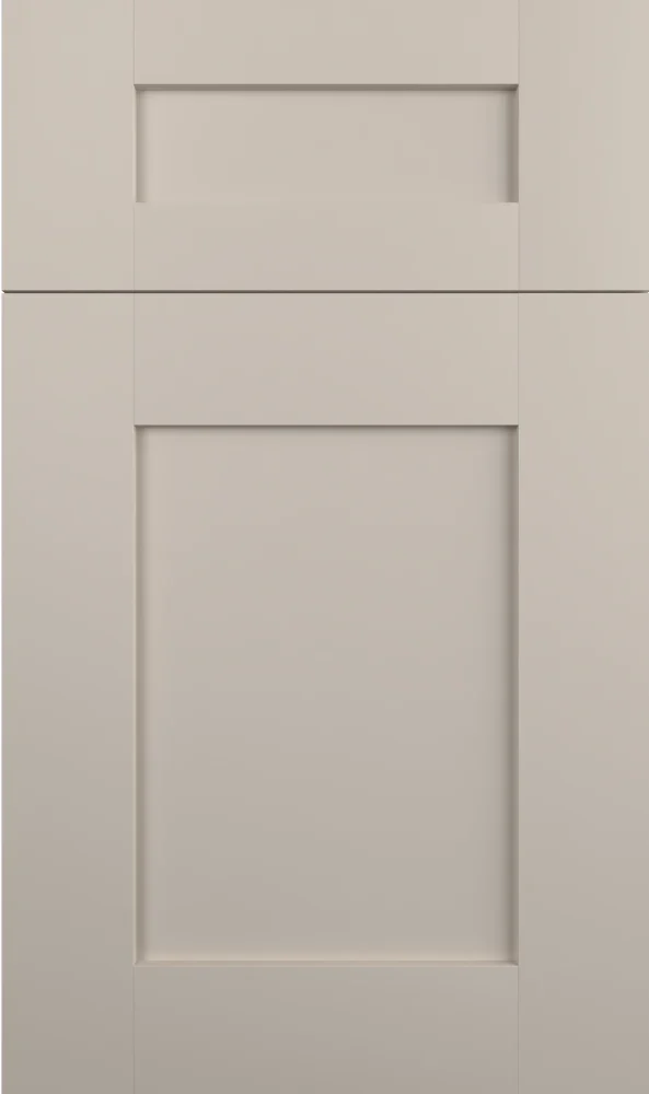
Despite the name, this is a greige rather than a gray, a warm putty with a clear tan lean and no blue in it at all. It has enough depth to define a cabinet run without darkening a room. We suggest it when white feels too plain and a true gray feels too cold for the space.
- Brand
- Kemper
- Finish
- Paint
- Availability
- Made to order
Color & Look
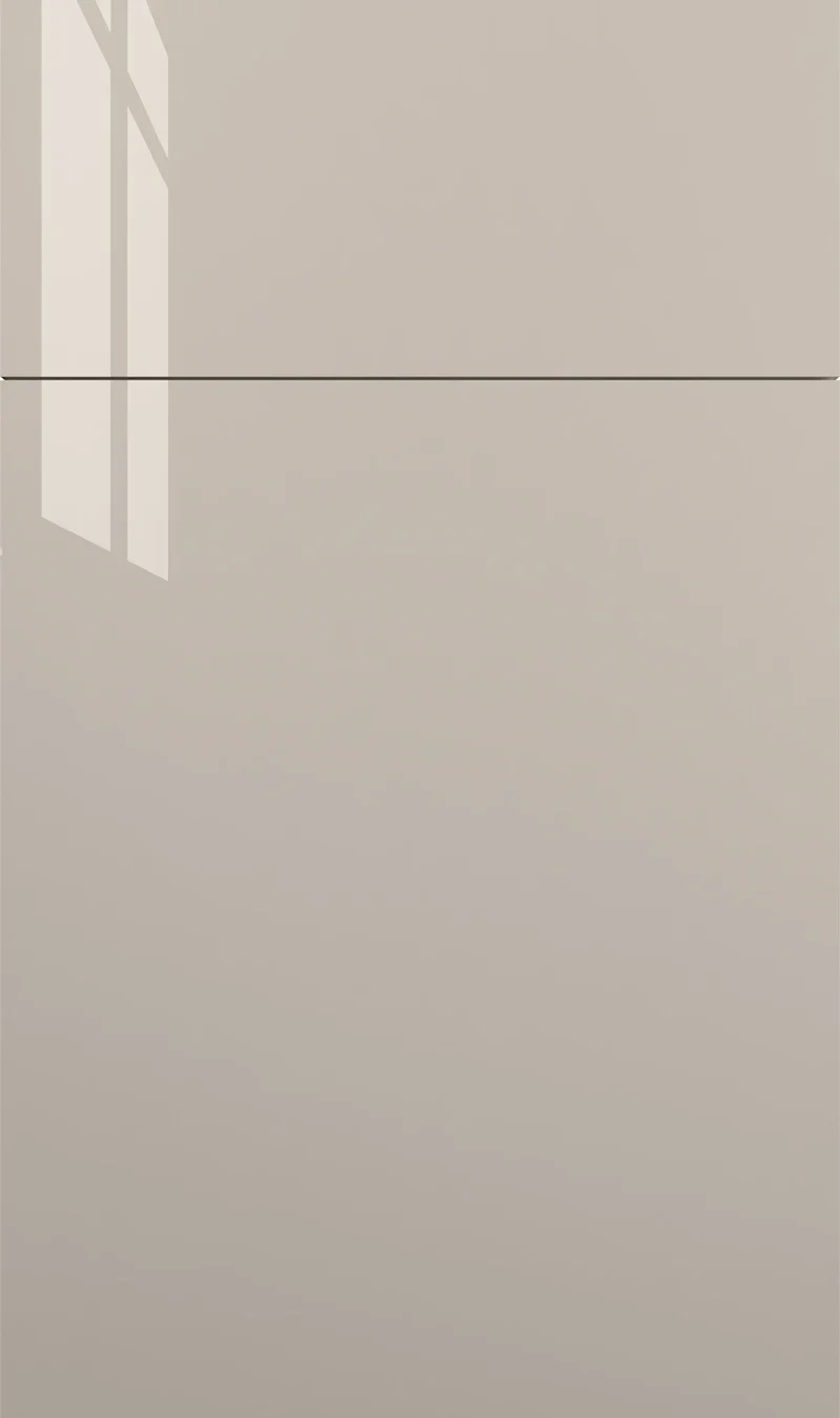
The measured hue sits at the warm end of the scale and the value is a few points below the off-whites, which is the combination that makes it read as a soft mushroom rather than as a stone gray. There is no blue anywhere in the mix. On the flat chip the film is smooth and unbroken, with a low sheen and no glaze or texture, so the color runs the same across doors, drawer fronts and end panels.
In north light the tan recedes and it behaves most like the gray its name suggests, a quiet, cool-leaning greige that sits well with white counters. South and west light bring the warmth forward and it can look closer to a light khaki late in the day. Warm bulbs push it further that way. This swing is the main thing to test before committing, because the two versions of it feel quite different in a room.
It is regularly mistaken for a beige in showroom light and for a gray in photographs, which tells you it is sitting right on the fence. Against Kemper’s Grey Stone, a glazed finish with a neutral base, this one is plainly warmer and has no dark profile line. Against Amaretto Crème it is lighter and simpler, a flat painted color whose depth comes from the paint itself rather than from a glaze.
Construction & Quality
Kemper has been making cabinetry in America since 1926 and is part of the MasterBrand family. Offered in the Kemper Emerge series.
Emerge is Kemper’s most personalized series: all-plywood construction, custom sizing, and a choice of full-overlay, inset or beaded-inset doors, with specialty finishes, stain and glaze options and multiple edge profiles.
Kemper backs its cabinetry with a limited lifetime warranty; coverage and terms are set by Kemper.
Where It Works
It handles a full kitchen comfortably, and it is one of our steadier recommendations for a two-tone scheme, since greige lowers with white uppers is a combination that has aged well and still looks considered. On an island alone it gives definition without the commitment of a dark color. In a small kitchen it works best below the counter line, with something lighter above, so the room does not close in.
Style-wise it is broad, because shaker, slab and inset doors all take it and it suits transitional and modern schemes as readily as traditional ones. It is a particularly good mudroom and laundry color, as a warm greige hides scuffs and dust far better than a white does. In a bath it makes a vanity that feels grounded, and in an office it gives built-ins some weight against pale walls.
Pairing Ideas
Countertops
Cambria Inverness Platinum, a bright white with marble-look veining, is the sharpest pairing and makes the greige look deliberate rather than accidental. Cambria Gladstone, Cambria Hailey and Cambria Ainsley in near-solid bright white give a clean lift. Cambria Crowndale in cream is the warmer route and softens the whole scheme considerably.
Countertops we carry →Backsplash
MSI Glossy White or MSI Dymo Calacatta White 12x24 Glossy keep the wall bright and let the cabinet color read as the feature. For texture without a color change, MSI Dymo Wavy White 12X24 Glossy 3D adds dimension. MSI Greta Encaustic or MSI Cecily Pattern Polished bring pattern, which a plain greige door carries well.
Backsplash tile →Hardware
This color takes almost any metal, which is part of its usefulness. Matte black gives the crispest, most current look. Brushed gold or champagne warm it and lean traditional. Brushed nickel, in the Berenson Bravo 56mm pull, is the neutral middle. Knurled or fluted pieces from the Richelieu Inspiration section add interest on plain doors without changing the palette.
Pulls & knobs →Floors
It is forgiving underfoot. Warm oak, cool white oak and mid-brown engineered hardwood all work, and a dark floor gives the most definition. The one pairing to think about is a floor with a strong yellow cast, which can drag the tan in the paint too far. Porcelain or ceramic tile in a soft stone look is a clean, durable match.
Flooring →Frequently Asked Questions









Plan a Kitchen in Agreeable Gray
Tell us about your room and we will help you decide whether Agreeable Gray is the right call, then design, order and install it.
Or call: (630) 733-7700