

Kemper · Paint
Kemper Cloud Kitchen Cabinets
Offered in the Kemper Echo, Choice and Emerge series
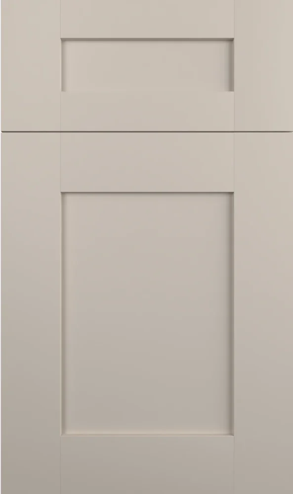
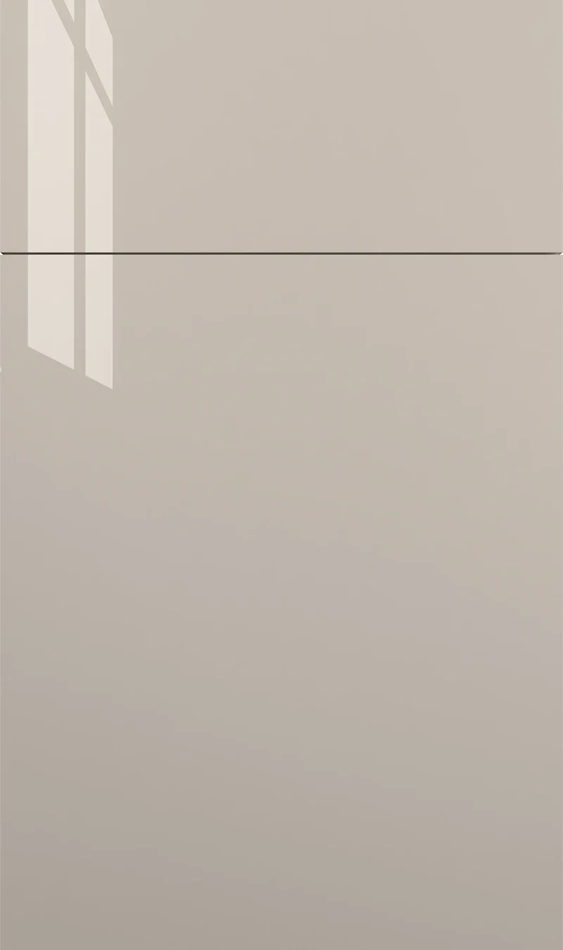
Despite the name, Cloud sits at the deeper end of the greige range — a mushroom-toned mid-gray with a faint green-yellow cast and very little saturation. It is dark enough to give a kitchen structure, quiet enough not to become the story. We see it most often on islands and lower cabinets.
- Brand
- Kemper
- Finish
- Paint
- Availability
- Made to order
Color & Look
On the chip this reads as a solid mid-tone — past halfway toward dark, well clear of anything you would call light. The chroma is very low, so it never looks like a green paint, but the hue sits far enough into the yellow-green range to give it a mushroom or drab quality rather than a straight gray. The painted surface is flat, even and free of grain or glaze, which keeps a large expanse of it looking calm rather than blotchy.
Cool north light suits it. There is enough depth here that the color does not go muddy the way a paler greige can; it simply reads grayer and a little cooler. Direct sun lifts the green-yellow and the cabinets look softer, closer to a sage-tinged gray. Under warm bulbs at night it deepens and can approach a light olive-brown. Of the neutrals in this family it is the most stable across lighting, which is worth something.
It is regularly mistaken for a soft sage, especially in photographs, and occasionally for a warm charcoal when the light is low. Neither is quite right — there is not enough green for sage and nowhere near enough depth for charcoal. Against Mindful Gray it is clearly a step darker and slightly greener; against Ashwood it is warmer and less neutral. If you want gray with a bit of earth in it, this is the one to look at.
Construction & Quality
Kemper has been making cabinetry in America since 1926 and is part of the MasterBrand family. Offered in the Kemper Echo, Choice and Emerge series.
Emerge is Kemper’s most personalized series: all-plywood construction, custom sizing, and a choice of full-overlay, inset or beaded-inset doors, with specialty finishes, stain and glaze options and multiple edge profiles.
Kemper backs its cabinetry with a limited lifetime warranty; coverage and terms are set by Kemper.
Where It Works
An island in Cloud with lighter perimeter cabinets is the pairing we build most often — the depth defines the middle of the room without pulling the whole kitchen down. Full-height use works in a well-lit kitchen and in larger rooms, where the color has space to breathe. In a small, low-light kitchen it will feel closed. It suits modern and transitional doors, and it takes black hardware particularly well.
A vanity in this color is a good bet in a bath with warm tile, where a cooler gray would feel clinical. Mudrooms and laundry rooms are an easy fit, since a mid-tone greige is forgiving about daily traffic. In a bar or a home office, Cloud behaves like a soft neutral backdrop and pairs comfortably with walnut shelving or a natural oak desk top.
Pairing Ideas
Countertops
Bright white gives the strongest contrast and the cleanest look — Cambria Ainsley, Vicostone Bendecio and Vicostone Prima are all near-solid whites that sit well above the cabinets in value. Vicostone Venatino adds marble-look veining if you want movement. For a softer, warmer kitchen, Cambria Crowndale, Cambria Kentmere or Cambria Axbridge bring cream into the mix.
Countertops we carry →Backsplash
Keep the wall bright to hold the room open. MSI White Matte 1x6 Stack Pattern is simple and modern; MSI Angora Tibi Polished and MSI Calacatta Gold Matte 1x3 Herringbone add light and pattern. If you want a warmer wall to counter the cool in the cabinets, MSI Angora Basketweave Polished is cream, and MSI Citadel Gold Trident brings a gold note.
Backsplash tile →Hardware
Matte black is the sharpest pairing and reads well against a mid-tone that already has a bit of earth in it. Brushed gold or champagne lifts the green-yellow in the paint and makes the whole thing warmer, which is a good move in a north-facing kitchen. Brushed nickel is the most restrained option and lets the cabinet color stay the quietest thing in the room.
Pulls & knobs →Floors
Warm wood is the counterweight this color wants. A mid to dark oak or walnut tone gives the room somewhere warm to sit and keeps the greige from feeling cold. Avoid gray-washed flooring, which can put the whole kitchen in one tonal band. In a bath or laundry, a warm-toned porcelain tile does the same job with more water tolerance.
Flooring →Frequently Asked Questions










Plan a Kitchen in Cloud
Tell us about your room and we will help you decide whether Cloud is the right call, then design, order and install it.
Or call: (630) 733-7700