

Kemper · Glazed paint
Kemper Amaretto Crème Painted & Glazed Cabinets
Offered in the Kemper Echo, Choice and Emerge series
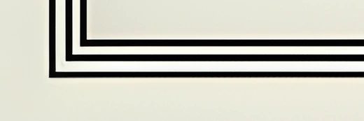
Take a warm cream door and run a dark glaze into every profile line, and you have Amaretto Crème. The body stays light and soft while the outlining is strong, close to a deep brown-black. It suits traditional and transitional kitchens that want definition without a dark cabinet color.
- Brand
- Kemper
- Finish
- Glazed paint
- Availability
- Made to order
Color & Look
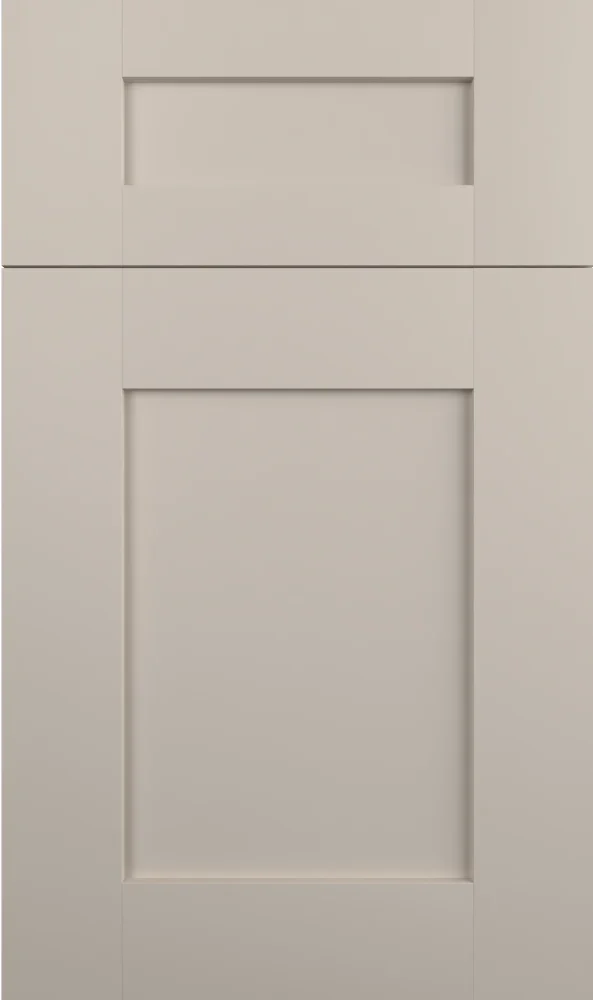
The base is a creamy greige, warmer than a neutral gray and a touch deeper than most off-whites in this range, which gives the finish a settled quality. The glaze is very dark, reading brown-black rather than pure charcoal, and it collects in the profile lines and edges with a slight feather where it was wiped back. On the flat sample the body is smooth and even, with the dark work confined to narrow bands.
Cool north light drops the warmth out of the base and the finish reads closer to a true greige, with the glaze looking almost black. In south and west light the cream comes forward and the glaze shifts visibly browner, which is the more flattering of the two versions in our experience. Under warm evening bulbs the body glows and the contrast between the base and the glaze is at its strongest.
On a screen it is often taken for a much darker cabinet than it is, because the eye averages the dark lines into the body color. In person the doors are clearly light. The closest relative in the range is Grey Stone, which uses a cooler, more neutral base and a charcoal glaze; put the two chips together and Amaretto Crème is plainly the warmer and creamier of the pair.
Construction & Quality
Kemper has been making cabinetry in America since 1926 and is part of the MasterBrand family. Offered in the Kemper Echo, Choice and Emerge series.
Emerge is Kemper’s most personalized series: all-plywood construction, custom sizing, and a choice of full-overlay, inset or beaded-inset doors, with specialty finishes, stain and glaze options and multiple edge profiles.
Kemper backs its cabinetry with a limited lifetime warranty; coverage and terms are set by Kemper.
Where It Works
It works across a full kitchen and is particularly effective on a furniture-style island or a hutch, where the dark profile line makes the piece read as built cabinetry rather than as boxes. Wall cabinets in the same finish are fine in a room with decent light, though in a dim kitchen we would keep the uppers lighter and use this below. The glaze needs light to be seen at all, so lighting matters.
Traditional kitchens are the natural setting, though it works in transitional rooms with plain shaker doors where the glaze is the only ornament. We have used the same idea in a bar, a butler’s pantry and a bath vanity, all places where detail is appreciated at close range. In a laundry or mudroom the base color holds up well against marks, even if the detail is largely wasted there.
Pairing Ideas
Countertops
Cambria Brittanicca Gold Cool, a cream quartz with marble-look veining, echoes the base and keeps the palette warm while adding movement. Cambria Colton and Cambria Ridgegate in near-solid cream are quieter versions of the same idea. For contrast, Cambria Bentley or Cambria Inverness Bronze in bright white with veining lift the counter clearly above the doors.
Countertops we carry →Backsplash
White mosaics suit the finish because the pattern holds its own against the glaze detail, and MSI Carrara White Basketweave Pattern Honed and MSI Bianco Dolomite Dotty Pattern both do that. MSI Athena Gold Chevron Pattern Honed brings a gold note that flatters the cream base. MSI Calacatta Blanco Pattern Polished is the brightest of the set and gives the most contrast.
Backsplash tile →Hardware
Bronze is the closest match to the glaze, and the Berenson Swagger 160mm MDB Pull reads as a single warm decision with it. Champagne and brushed gold lighten the room and pick up the cream instead. Vintage nickel is the neutral option that works when the countertop is cool. Matte black repeats the glaze line hardest, but it can flatten the brown in it.
Pulls & knobs →Floors
Warm mid-tone hardwood is the traditional match and the one we specify most, in oak or hickory. A darker floor also works and lets the light cabinet body carry the room. Avoid a cool gray-washed wood, which sets the cream base on edge. Porcelain tile in a travertine or warm limestone look is a durable option that stays in the same family.
Flooring →Frequently Asked Questions









Plan a Kitchen in Amaretto Crème
Tell us about your room and we will help you decide whether Amaretto Crème is the right call, then design, order and install it.
Or call: (630) 733-7700