

Kemper · Paint
Kemper Flurry Kitchen Cabinets
Offered in the Kemper Emerge series
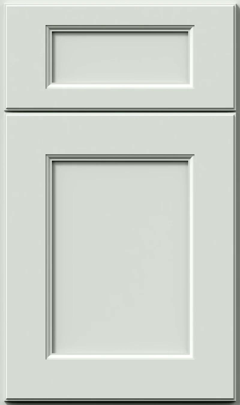
Flurry belongs to the group of whites that are not quite white. A soft green-gray sits underneath it, enough to keep the cabinets from looking sterile but not enough to register as color from across the room. People choose it when plain white starts to feel hard and clinical to them.
- Brand
- Kemper
- Finish
- Paint
- Availability
- Made to order
Color & Look
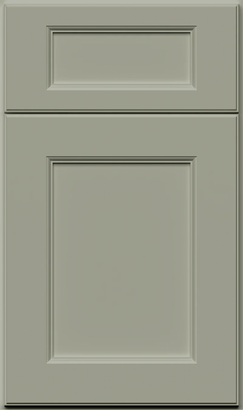
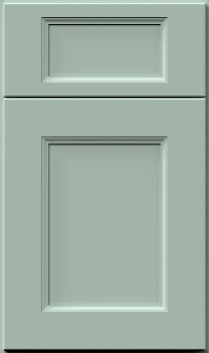
This is a very high-value paint, only a small step down from white, and the undertone underneath is a cool green. It is held so lightly that on a bright day a run of cabinets simply looks like a soft off-white. The sample has a faint cloudiness to it rather than a dead-flat film, which is what a low-sheen paint does at this lightness. There is no grain, no glaze and no wiping anywhere in the finish.
North light is where Flurry earns its place. That exposure tends to make pure whites look blue and a little cheap, and the green in Flurry softens the effect and keeps the cabinets looking settled. In south light it lightens further and can look nearly white, with the green showing only where doors turn away from the window. Warm bulbs at night give it a faint creaminess. It is at its greenest in shadow and in light bouncing off a lawn.
Most people take it for a plain white, and occasionally for a very pale gray. The comparison that matters is Sea Salt, which sits at essentially the same lightness but holds a little more color — put them together and Sea Salt is the one that looks green, Flurry the one that looks like a soft white. Against bright white quartz Flurry shows its gray; against an antique or creamy white it suddenly looks clean and cool.
Construction & Quality
Kemper has been making cabinetry in America since 1926 and is part of the MasterBrand family. Offered in the Kemper Emerge series.
Emerge is Kemper’s most personalized series: all-plywood construction, custom sizing, and a choice of full-overlay, inset or beaded-inset doors, with specialty finishes, stain and glaze options and multiple edge profiles.
Kemper backs its cabinetry with a limited lifetime warranty; coverage and terms are set by Kemper.
Where It Works
Flurry is a whole-kitchen color. It works on uppers and lowers together, in rooms of any size, and it is one of the few finishes here that genuinely improves a dark kitchen instead of merely tolerating one. In a large room it can feel a bit undifferentiated on its own, so we usually give the island a deeper color or a stain. Run to the ceiling, Flurry reads tall and quiet and keeps the eye moving.
It fits almost any door style — Shaker, inset, beaded inset, or a plain slab for something more modern — and its softness suits older homes where a bright white can look imported. Away from the kitchen it is a natural for bath vanities, laundry cabinets and a bar. In a mudroom it will show wear sooner than a mid-tone will, so think honestly about how that space gets used before committing.
Pairing Ideas
Countertops
Near-solid whites keep this simple. Vicostone Milky White or Vicostone Aspen, both bright white quartz, sit close in value and let the whole room read as one clean surface. For separation, MSI Calacatta Miraggio Duo brings marble-look veining in bright white quartz. Vicostone Galilea in cream quartz warms the room if it runs cold.
Countertops we carry →Backsplash
With cabinets this pale, the backsplash carries the texture. MSI Arabescato Cararra Octagon in white natural stone adds pattern without adding color. MSI Calacatta Gold Matte Round is the warmer choice and brings a little gold into the palette. MSI Volcanic Luxe Interlocking in white glass has the most surface interest if you want the wall working harder.
Backsplash tile →Hardware
Because Flurry is so light, hardware becomes the main drawn line in the kitchen. The Berenson Metro 160mm Matte Black Pull draws that line sharply and suits a modern farmhouse room. The Berenson Swagger 96mm Modern Brushed Gold Pull is the softer, warmer option. Brushed nickel nearly disappears, which is fine if you want the run uninterrupted.
Pulls & knobs →Floors
A mid to dark floor gives Flurry the contrast it needs, and white oak in a natural or medium brown finish is the usual answer. Very pale floors can leave the whole room looking washed out. LVP handles a kitchen that takes a beating, and porcelain tile in a warm gray keeps the palette cool without tipping cold.
Flooring →Frequently Asked Questions









Plan a Kitchen in Flurry
Tell us about your room and we will help you decide whether Flurry is the right call, then design, order and install it.
Or call: (630) 733-7700