

Kemper · Paint
Kemper Emma Kitchen Cabinets
Offered in the Kemper Emerge series
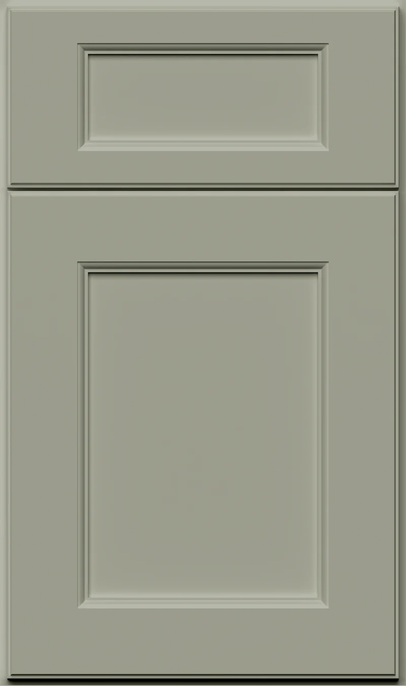
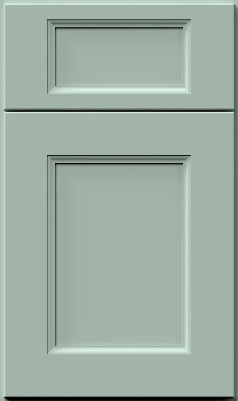
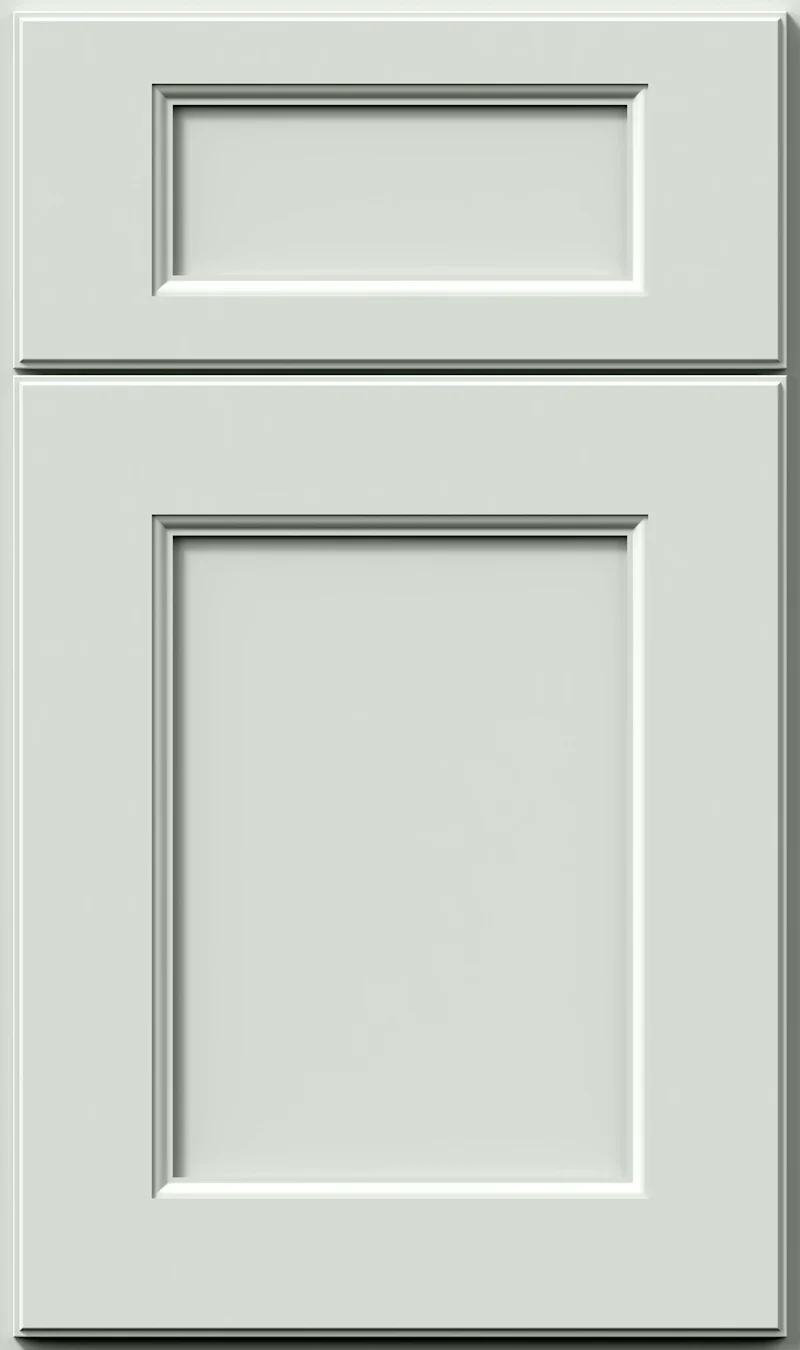
Emma is the deep end of this green family. From across a room it reads as a near-charcoal; closer in, a green-gray emerges with a faint blue in it, like a dark spruce with most of the color drained out. It gives a kitchen real weight and it wants a bright counter to work against.
- Brand
- Kemper
- Finish
- Paint
- Availability
- Made to order
Color & Look
This is a dark finish, well below the midpoint, and depth is the first thing you notice about it. The green underneath is cool and quiet, closer to the blue side than the yellow side, so there is nothing olive or earthy about it. Because the color is dark and low in saturation, large areas of it flatten into shadow, and edges and reveals stop being obvious. The sample is smooth painted film with no glaze, no wiping and no grain coming through.
Dark colors show their undertone in bright light and lose it in dim light, and Emma is a clear case. In a south-facing kitchen the green is readable and the cabinets look soft. In a north-facing room or in the evening it drifts toward a deep gray-black, and only the doors nearest the window keep any green in them. Good undercabinet lighting makes a real difference here, more than it would with a mid-tone color.
It gets mistaken for charcoal, for a dark slate, and occasionally for a very dark forest green. Against Retreat, which is the nearest lighter relative, Emma is several steps deeper and reads bluer; Retreat looks almost pale beside it. Against a true black it is obviously softer and clearly green. On a large run the color changes with the angle of the light rather than the finish, since there is nothing textured in it.
Construction & Quality
Kemper has been making cabinetry in America since 1926 and is part of the MasterBrand family. Offered in the Kemper Emerge series.
Emerge is Kemper’s most personalized series: all-plywood construction, custom sizing, and a choice of full-overlay, inset or beaded-inset doors, with specialty finishes, stain and glaze options and multiple edge profiles.
Kemper backs its cabinetry with a limited lifetime warranty; coverage and terms are set by Kemper.
Where It Works
We would not put Emma on a whole kitchen unless the room is large and well lit, and even then only with plenty of white above the counter. Its natural place is the lower cabinets and the island, with pale uppers or open shelving above. Used that way it grounds a room and makes a white counter look brighter by contrast. A floor-to-ceiling pantry wall in Emma also works, treated as a deliberate block of color.
It suits transitional and modern kitchens best, and it looks particularly good on flat slab fronts where nothing interrupts the color. In a powder room it can take the whole vanity and even the walls, because small dark rooms often benefit from being fully committed. It is also a strong choice for a bar, a study built-in, or a mudroom bench and lockers, where the depth hides everyday marks well.
Pairing Ideas
Countertops
Emma needs a bright counter to stay open. Cambria Sutherland, a near-solid bright white quartz, gives the cleanest break. Cambria Inverness Bristol Bay and Cambria Oakleigh add marble-look veining in bright white quartz for more movement. If the room feels too stark, Cambria Brittanicca Warm in cream quartz softens the contrast without losing brightness.
Countertops we carry →Backsplash
Go light. MSI Pietra Calacatta White or MSI Porcelain Tile Eden Dolomite in white natural stone bounce light back down onto the dark cabinets. MSI Carrara White Valentino Fluto brings a fluted texture that catches undercabinet light. MSI Adella Viso White in white porcelain adds a three-dimensional surface for kitchens that want more than a flat wall.
Backsplash tile →Hardware
Brass reads clearly against this depth and is the most flattering choice — the Berenson Swagger 96mm Modern Brushed Gold Pull stands out without looking ornate. The Berenson 128mm Champagne Bar Pull is the softer, paler version. Brushed nickel works if you want the hardware quieter, and matte black will nearly disappear, which is occasionally the goal.
Pulls & knobs →Floors
Lighter floors are the safer route with a color this deep, and natural white oak is the usual answer. A medium brown hardwood also works if the counters and walls are bright enough to carry the room. Dark floors with Emma cabinets can make a kitchen feel bottom-heavy. Light porcelain or LVP both work where the kitchen sees heavy traffic.
Flooring →Frequently Asked Questions









Plan a Kitchen in Emma
Tell us about your room and we will help you decide whether Emma is the right call, then design, order and install it.
Or call: (630) 733-7700