

Kemper · Stain
Kemper Seal Kitchen Cabinets
Offered in the Kemper Choice and Emerge series
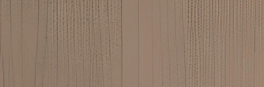
Seal is the deepest of the grayed browns here — a soft, weathered taupe with the grain clearly present. It has almost no gold in it, which makes it an easy partner for gray quartz and cool tile. We use it often when someone wants a dark cabinet that is not brown or black.
- Brand
- Kemper
- Finish
- Stain
- Availability
- Made to order
Color & Look
Depth is what separates this from the other greiges: it sits well below the middle of the range and holds its color even under strong light. The undertone is gray-brown with a faint warm note, closer to wet sand than to chocolate. Against a white counter it reads as a soft charcoal-brown; against a black appliance panel it looks clearly lighter and browner than it does on its own.
The grain shows as fine open pores over part of the surface and as long, soft V-shaped lines elsewhere, with a few darker marks running through. The stain is deep enough to mute all of that into texture rather than pattern, so from a few feet away the doors read as an even color and the grain only announces itself up close. That balance is why it works in both plain and detailed kitchens.
North light pushes it gray and it can look almost slate on an overcast day. Warm afternoon light brings the brown back and softens it. In photographs it is regularly mistaken for a painted greige or a driftwood-toned paint, and clients are often surprised to learn it is a stain. Next to Morel it is clearly deeper and cooler; next to Kanga it is grayer and far less chocolate.
Construction & Quality
Kemper has been making cabinetry in America since 1926 and is part of the MasterBrand family. Offered in the Kemper Choice and Emerge series.
Emerge is Kemper’s most personalized series: all-plywood construction, custom sizing, and a choice of full-overlay, inset or beaded-inset doors, with specialty finishes, stain and glaze options and multiple edge profiles.
Kemper backs its cabinetry with a limited lifetime warranty; coverage and terms are set by Kemper.
Where It Works
As a whole-kitchen color it needs light and it needs a bright counter. In a room with good windows, Seal on every cabinet with white quartz tops looks settled rather than heavy. In a small or dim kitchen we would use it below the counter and on the island, with light uppers to keep the ceiling line open. It also makes a strong contrast island in a mostly white kitchen.
The color reads transitional and modern more than traditional, and it suits an industrial-leaning room particularly well alongside concrete-look counters. Because it is a deep, grayed tone, it is one of the most practical finishes for a mudroom or laundry, where marks and scuffs simply do not show. It also makes a composed bath vanity, and a bar or media wall where a darker cabinet is wanted without going black.
Pairing Ideas
Countertops
Light gray stops the cabinets reading heavy. Vicostone Ceppo Di Gre and MSI Concerto are near-solid grays with clean contrast. MSI Calacatta Karmelo brings marble-look veining and lifts the room. For natural stone, MSI Gray Canyon is a near-solid gray quartzite and MSI Audacia is a gray quartzite with visible veining.
Countertops we carry →Backsplash
You can go bright or go tonal. MSI Pavilion Picket Geometric and MSI Medici Gold Geometric are white mosaics that give the room a light band between counter and uppers. For a quieter, tonal scheme, MSI Renzo Storm 5x5 keeps the grays together, and MSI Sliced Coal Pebbles adds real texture in a deeper gray.
Backsplash tile →Hardware
Brushed nickel and vintage nickel both sit well on a grayed brown — the Berenson Epoch Edge 128mm Vintage Nickel Pull in particular suits the weathered character. Champagne and brushed gold give a warmer, more deliberate contrast that shows clearly against the dark doors. Matte black is the subtlest option here, since it nearly blends in.
Pulls & knobs →Floors
A light floor gives the most useful contrast under a deep cabinet — pale engineered oak, a whitewashed plank, or a light greige LVP. A mid-gray porcelain tile also works and ties in with concrete-look counters. Dark floors are possible, but with dark cabinets underfoot the room needs a bright counter and good lighting to stay open.
Flooring →Frequently Asked Questions







Plan a Kitchen in Seal
Tell us about your room and we will help you decide whether Seal is the right call, then design, order and install it.
Or call: (630) 733-7700