

Kemper · Stain
Kemper Light Kitchen Cabinets
Offered in the Kemper Choice series
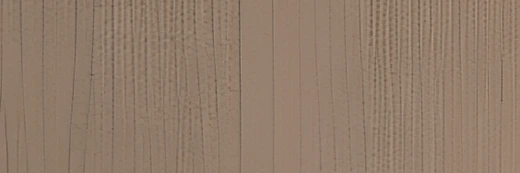
Despite the name, this is not a pale finish. Light is a golden amber stain with real depth to it and a flowing grain that reads clearly across the door. It brings warmth to rooms that need it, and it wants cool counters and cool tile alongside to keep its balance.
- Brand
- Kemper
- Finish
- Stain
- Availability
- Made to order
Color & Look
The color is a saturated golden brown — warmer and more concentrated than most of the stains in this range. In depth it sits just below the middle, so it is not a light finish in the usual sense, and the name is worth setting aside. The undertone is amber, with a hint of red behind it. Under a white counter it looks rich; under a cream one it can edge toward orange.
Grain is the second half of the story. Fine vertical lines run through the paler areas and open into a broader, flowing figure where the wood changes direction, so there is movement across the surface rather than an even field of color. The stain is clear rather than opaque, which lets that figure show. Expect character from door to door instead of a uniform match.
In a north-facing room the amber calms and reads as a warm honey, which is where we like it best — it warms a cool room in a way that a gray or greige stain cannot. In strong afternoon sun it intensifies and the red comes up. Most people take it for a golden oak or a stained maple at first glance. It is deeper and more even in color than a typical oak, with more amber in the base.
Construction & Quality
Kemper has been making cabinetry in America since 1926 and is part of the MasterBrand family. Offered in the Kemper Choice series.
Choice carries Kemper’s construction into a wider range of door styles, a deeper palette of colors and finishes, and more functional storage.
Kemper backs its cabinetry with a limited lifetime warranty; coverage and terms are set by Kemper.
Where It Works
A full kitchen in Light suits a room that is short on sun or leans cool — it puts warmth back without going dark. In a bright, south-facing kitchen it can be a lot across every cabinet, and we would use it on the island or the lower run and keep the uppers pale. The color is also strong enough to hold its own as a single feature: a tall pantry wall, or the run behind a range.
Traditional and craftsman kitchens are its home ground, and it also suits a warm contemporary room where wood tone is used deliberately against white and black. Elsewhere in the house it makes a handsome bar or study, both places where a richer wood is welcome. In a bathroom it needs a white or pale top to keep the balance, and in a laundry it holds up well to daily use.
Pairing Ideas
Countertops
Cool, quiet gray is the right answer. Vicostone Icelake and Vicostone Castelo are near-solid grays that balance the amber without competing. For pattern, Vicostone Gioia Carrara and MSI Calacatta Versailles are gray quartz with marble-look veining. MSI Cristallo, a near-solid gray quartzite, is the option with natural stone character.
Countertops we carry →Backsplash
Keep it bright and cool. MSI Hexagon Glossy Mosaic White throws light back into the room and reads clean against a warm cabinet. MSI Pietra Calacatta White gives a stone look in a paler key. For texture without extra color, MSI Retro Octagon Bianco 6mm Glossy adds pattern while staying firmly white.
Backsplash tile →Hardware
Matte black is the most reliable partner — it draws a crisp line against the amber and keeps the look current. The Berenson Metro 160mm is the straightforward version. Brushed nickel is the softer cool choice. Piling gold on gold is the one to think twice about, unless the counters and tile are decidedly cool.
Pulls & knobs →Floors
This cabinet color is warm enough that the floor should not be. A gray or greige LVP, a pale white-oak plank, or porcelain tile in a soft gray all give the separation the room needs. A dark espresso hardwood also works and makes the cabinets look brighter. What does not work is a golden oak floor, which leaves the room with no cool note at all.
Flooring →Frequently Asked Questions







Plan a Kitchen in Light
Tell us about your room and we will help you decide whether Light is the right call, then design, order and install it.
Or call: (630) 733-7700