

Kemper · Paint
Kemper Grays Harbor Kitchen Cabinets
Offered in the Kemper Emerge series
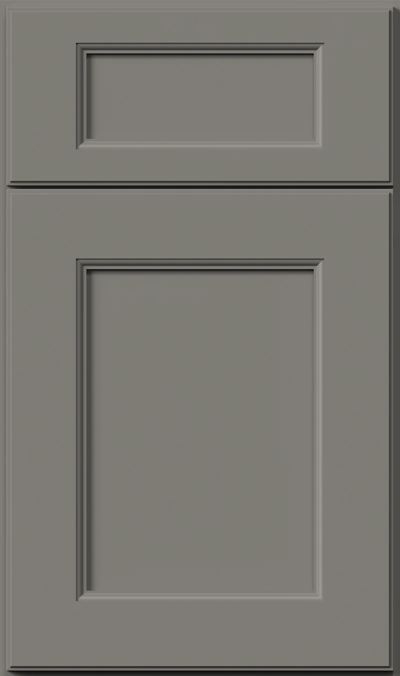
A step darker again, Grays Harbor is a deep blue-gray sitting close to the line where gray becomes charcoal. There is more color in it than the name suggests — a cool, slightly marine blue that shows itself against white. It gives a kitchen real weight and it rewards a bright countertop.
- Brand
- Kemper
- Finish
- Paint
- Availability
- Made to order
Color & Look
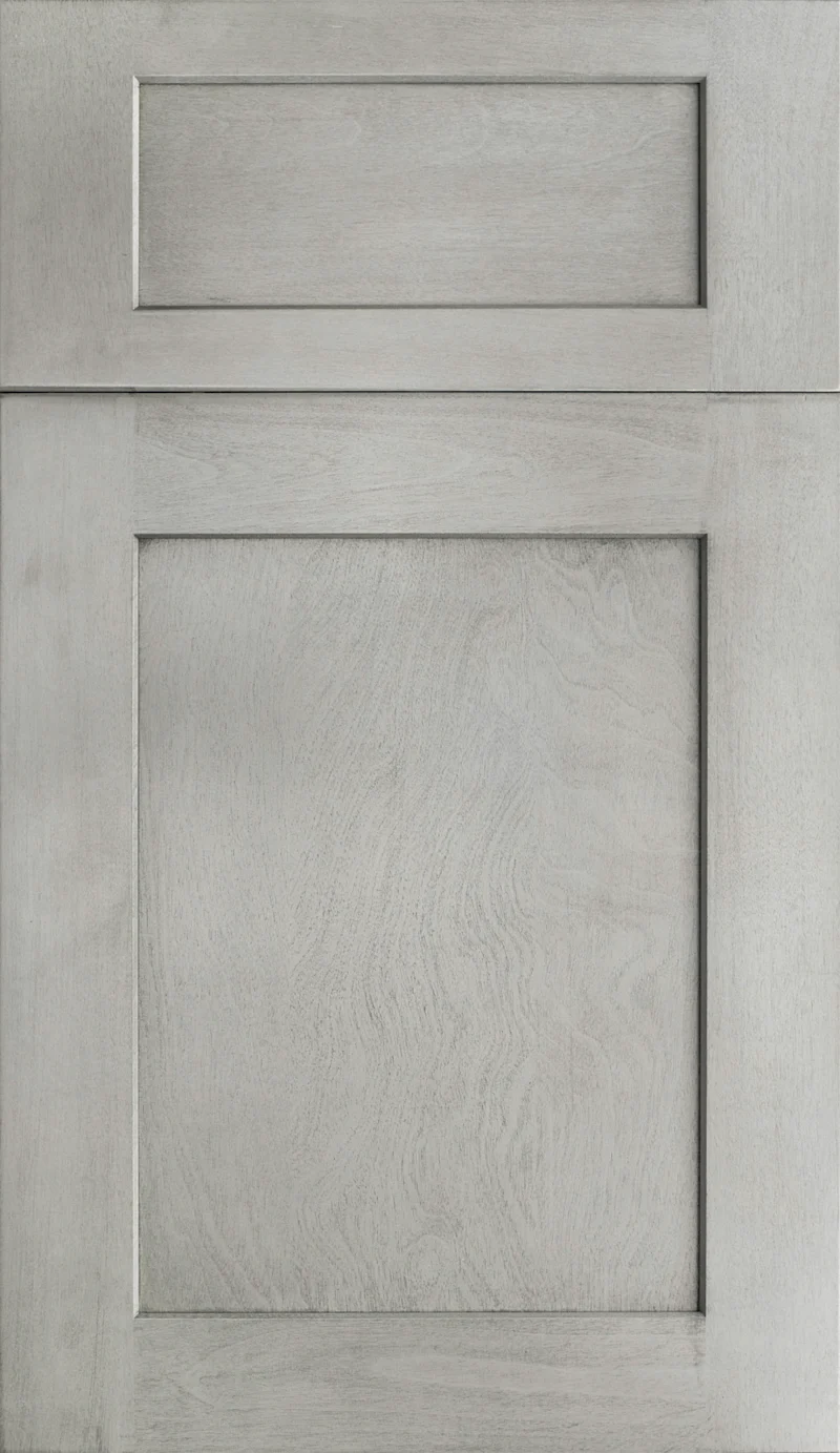
Deep and clearly cool, this color is close enough to charcoal that in a dim room the distinction stops mattering, and different enough in good light that the blue is unmistakable. The sample has a slight softness to the surface — not a texture you could feel, but the color does not sit perfectly flat the way the lighter finishes in the series do. There is no glaze, no wiping and no wood grain anywhere in it.
Exposure changes this color more than most. In south and west light the blue reads clearly and the cabinets look considered and slightly nautical. In north light it loses that and settles into a dense, cool charcoal. On an overcast winter afternoon a full run of it can look almost black at the far end of a room. Warm lighting is the counterweight, and we would specify warm-white bulbs with this color as a matter of course.
People call it charcoal, navy and slate in roughly equal measure, which tells you how much the light is driving the reading. Beside Moonstone it is a shade deeper and a shade more colored. Beside Peppercorn it is clearly the bluer of the two, where Peppercorn is a straight neutral charcoal. Beside Emma it is cooler and less green. Those distinctions are easy to miss in a sample and obvious across a kitchen.
Construction & Quality
Kemper has been making cabinetry in America since 1926 and is part of the MasterBrand family. Offered in the Kemper Emerge series.
Emerge is Kemper’s most personalized series: all-plywood construction, custom sizing, and a choice of full-overlay, inset or beaded-inset doors, with specialty finishes, stain and glaze options and multiple edge profiles.
Kemper backs its cabinetry with a limited lifetime warranty; coverage and terms are set by Kemper.
Where It Works
Grays Harbor is at its best on base cabinets, an island, or a single tall run treated as a block. Paired with white or cream uppers it gives a kitchen structure without making the room dark, and the contrast is strong enough that it reads as a design decision rather than a compromise. A whole kitchen in this color works only where daylight is genuinely abundant and the counters and backsplash are bright.
It suits transitional and modern rooms, and on inset doors it can look quite traditional and handsome. Outside the kitchen it is a good bar or butler’s pantry color, where a dark cabinet feels appropriate, and it is a practical mudroom finish because the depth hides scuffs and shoe marks. On a bath vanity in a smaller room it reads rich, especially with white stone above and a warm metal faucet.
Pairing Ideas
Countertops
Cambria Hemsworth, a bright white quartz with marble-look veining, is the high-contrast pairing and the one that makes the blue read clearest. For a warmer, less stark result, Cambria Beaumont in cream quartz with marble-look veining softens the whole room. Cambria Hermitage or Cambria Clyde, both near-solid cream quartz, are the quieter options.
Countertops we carry →Backsplash
Warm, light tile is the counterbalance to a cold, deep cabinet color. MSI Ivory Ansello Ceramic or MSI MALAHARI GREIGE in cream porcelain both do that work well. MSI Hexley Ecru in white porcelain is the brightest choice. If you prefer a tonal kitchen, MSI Durban Anthracite in gray porcelain extends the darkness up the wall deliberately.
Backsplash tile →Hardware
Brass and champagne are the finishes that stand out against this depth — the Berenson Swagger 96mm Modern Brushed Gold Pull or the Berenson 128mm Champagne Bar Pull both read clearly and warm the blue. For a cooler kitchen, the Berenson Epoch Edge 128mm Vintage Nickel Pull adds a little age without adding warmth to the palette.
Pulls & knobs →Floors
A light floor is the honest recommendation here. Natural white oak or a pale engineered hardwood keeps the kitchen from becoming heavy underneath. A medium brown floor also works if the uppers are white. What does not work is a dark floor with dark cabinets in an average-sized room — it closes the space down faster than most people expect.
Flooring →Frequently Asked Questions









Plan a Kitchen in Grays Harbor
Tell us about your room and we will help you decide whether Grays Harbor is the right call, then design, order and install it.
Or call: (630) 733-7700