
J&K · Paint
J&K Pure Kitchen Cabinets
Available as door style B5 in J&K’s Transitional range
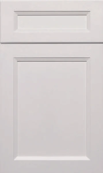
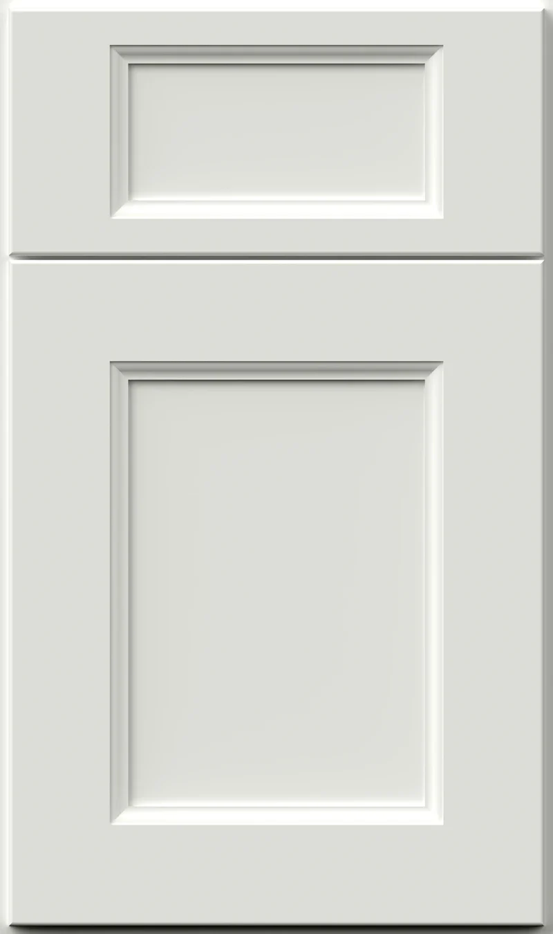
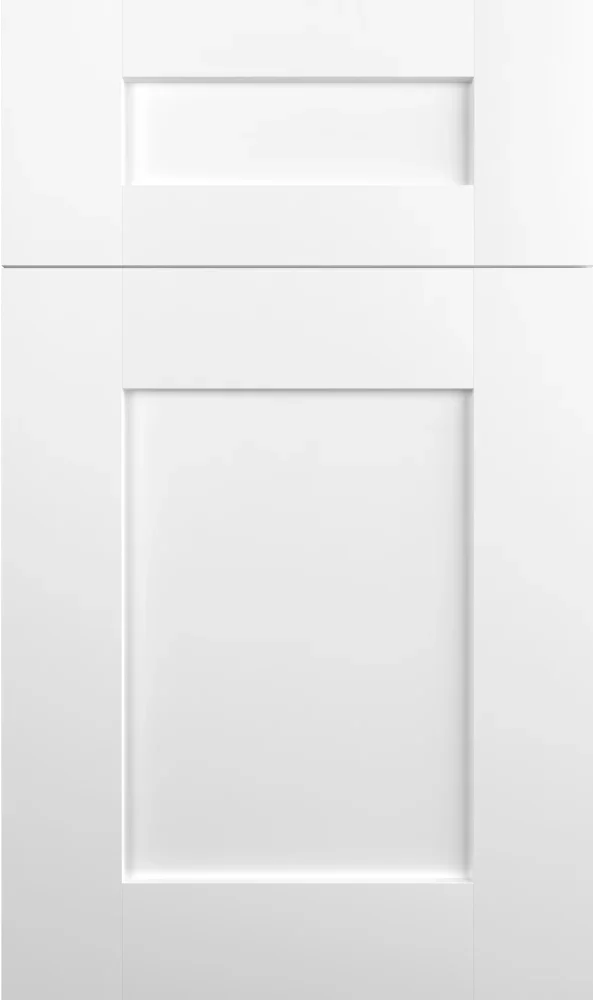
A clean white with just enough gray to keep it from glaring, Pure is the white we reach for when a kitchen should look bright rather than clinical. There is no yellow in it at all. On the B5 door it reads crisp and even, and it is an easy color to build a whole kitchen around.
- Brand
- J&K
- Finish
- Paint
- Availability
- Made to order
Color & Look
Pure is a neutral white rather than a warm one. Whatever tint it carries reads as gray, not cream, and there is no beige pulling at it. Next to J&K Dove the two sit at roughly the same brightness, so what separates them is temperature rather than value: Dove looks warm and faintly putty, Pure looks clean and slightly cool. It is not a stark blue-white either — the small amount of gray in it keeps the surface from flaring under bright light.
Because it is close to neutral, Pure takes on whatever the room gives it. In north light it cools noticeably and can read faintly gray, which suits a kitchen with gray counters and suits a warm room less well. South and west light keep it bright and true, and late sun warms it temporarily without changing its character. Under warm bulbs it softens toward ivory; under daylight-temperature LEDs it stays crisp and can tip slightly cold.
Most people assume any white cabinet will match their white trim, and this is where that assumption tends to break down. Pure is unlikely to match an existing warm trim color, and the mismatch is most obvious where door casing meets a tall cabinet. It is worth checking before ordering. The finish is a smooth satin with no grain telegraphing through, and the B5 door profiles throw enough shadow to define the panel without any glaze or antiquing in the corners.
Design & Profile
Four sloped planes do the work on this door. The frame’s inner edge breaks into a wide shoulder that angles down to a flat center field, and because each of the four sides faces a different way, each takes the light differently, the top one shaded and the bottom one bright. Where they meet, the shoulder miters into a crisp diagonal. Rails and stiles are even and wide, the opening is square, and the drawer front repeats the whole arrangement as one long, shallow version of the same recess.
The shadow around the panel is what keeps this door from flattening into a blank rectangle, and because the shoulder is wide, that shadow stays legible even from the far side of a room. The center panel on the S and B styles is an all-wood reversed raised panel, which is where the slope comes from. Each door is 3/4-inch solid wood and hung full overlay, so fronts close up with narrow gaps and the mitered corners stack neatly above one another. We would say it shows its shape before it shows anything else.
Construction & Quality
J&K builds this cabinetry from 100% solid wood: a 3/4″ solid-wood full-overlay door, drawers of 5/8″ solid wood on all sides in dovetail construction, and a cabinet-grade plywood box with a clear-coated interior. Available as door style B5 in J&K’s Transitional range.
Doors run on 6-way adjustable, soft-close hidden Euro-style hinges, drawers on soft-close concealed undermount glides, and base cabinets carry corner-bracket reinforcements. The finish is hand-rubbed.
Where It Works
A whole kitchen in Pure is the straightforward use and the one we see most. It suits small and dark kitchens especially, since it returns more light than any other color in the range, and it makes a low ceiling feel higher than it is. Transitional and modern rooms take it easily. In a very traditional kitchen it can read a touch cold unless the counters, floor or hardware bring some warmth back.
As a partner color it is just as useful — Pure on the perimeter with a dark island is one of the most durable arrangements in kitchen design, and it is easy to revise later by changing only the island. Outside the kitchen it works on a bath vanity, in a laundry, at a bar or across a wall of office cabinetry. The honest trade-off is upkeep: a clean white shows scuffs at the toe kick and around pulls more than a mid-tone does.
Pairing Ideas
Countertops
White on white is the look here, and near-solid quartz keeps it from going flat — Cambria Lakedale, Cambria Minnesota Snow and Cambria Whitendale all sit close in tone with just enough movement to stay interesting. For contrast, Cambria Brittanicca Gold Cool adds marble-look veining with a warm thread running through it. Cambria Ridgegate in cream is the warmest option of the group.
Countertops we carry →Backsplash
You can go tonal or make the wall the feature. MSI Whisper White and MSI Stella La Perla 2X10 Glossy stay close to the cabinet color and let the counter lead. MSI Urbano Graphite in gray gives a strong graphic break against white doors. MSI Adella Gris, a white mosaic, adds texture and a satin surface without shifting the color much at all.
Backsplash tile →Hardware
White doors show hardware plainly, so the metal choice carries real weight. Berenson Bravo 56mm in brushed nickel recedes politely. The Berenson Metro 160mm Matte Black Pull is the high-contrast option and reads modern and graphic. Berenson Epoch Edge 128mm in vintage nickel adds a slightly aged note that keeps a white kitchen from looking brand new on day one.
Pulls & knobs →Floors
Almost anything works, which makes the floor the right place to put the warmth. Mid to dark engineered or solid hardwood gives a white kitchen the grounding it needs. Warm oak-toned LVP is the practical equivalent. Gray porcelain or ceramic tile pairs neatly with how neutral this white is, though with white counters as well the room can end up feeling cool.
Flooring →Frequently Asked Questions




Plan a Kitchen in Pure
Tell us about your room and we will help you decide whether Pure is the right call, then design, order and install it.
Or call: (630) 733-7700