
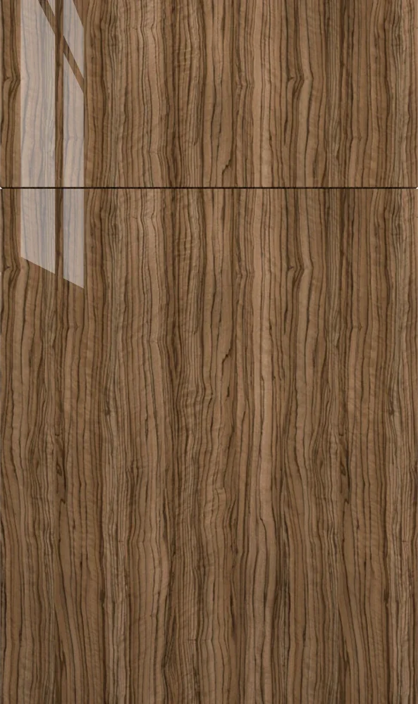
Fabuwood · Applied surface
Fabuwood Olivo Kitchen Cabinets
Available on the Catalina door
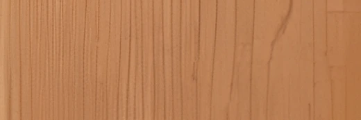
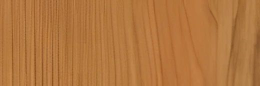
Olivo takes a narrow, ribbon-like wood grain and puts it under a glossy surface, so a warm mid-brown picks up light the way a polished veneer does. The stripe runs vertically and reads as furniture rather than cabinetry. It suits people who want wood tone without the matte, rustic version of it.
- Brand
- Fabuwood
- Finish
- Applied surface
- Availability
- Made to order
Color & Look
The ground color is a mid-brown with real warmth in it — a golden, slightly olive cast rather than the red of cherry or the cool ash of a gray-stained oak. Running through it are tight vertical stripes, alternating light caramel and a much darker coffee, close together and mostly straight, with occasional wandering lines where the figure changes. It is a printed veneer look rather than sawn timber, so the pattern repeats cleanly and there is no open pore to catch dirt.
Gloss changes how the grain behaves. In direct sun the light stripes flare and the door looks two shades lighter than it does in shade; in north light the darker lines dominate and the whole thing reads deeper and browner. Standing at an angle you catch the reflection first and the grain second, which is why a run of Olivo looks different as you walk past it. That is part of the appeal, but it also means a single photograph never tells the whole story.
Walnut is the usual guess, and the tone is close, though the stripe here is finer and more regular than walnut usually runs. Others read it as zebrawood or olive ash, which is nearer the mark. What separates it from a matte wood finish is not really the color but the surface: a matte wood door keeps its color quiet and even, while this one keeps catching the eye and shifting as you move. If you have only ever seen wood-look cabinetry in a flat finish, expect something considerably more reflective.
Construction & Quality
Olivo belongs to Fabuwood’s Illume & Ovela series — European frameless construction with applied gloss, matte and textured surfaces rather than paint or stain.
Every Fabuwood cabinet is fitted with Blum soft-close hinges and drawer systems. Fabuwood backs its cabinetry with a lifetime warranty, with a separate Blum warranty on the hardware, and lists CARB2 compliance and ICC-ES and AWI/QCP certification.
Fabuwood groups its colors in tiers. Olivo is a Designer color, which is made to order rather than stocked, so it is worth allowing for that in the schedule.
Where It Works
A whole kitchen in Olivo is a commitment — a lot of grain and a lot of reflection in one room. It works when the space is big enough to carry it and there is a generous white counter and backsplash to give the eye somewhere to rest. More often we use it on an island or on lowers, with a white or pale gray above, so the wood becomes the feature and the room stays open. In a small kitchen, keep it to one run.
It suits contemporary and mid-century-leaning rooms, and it also sits well in a transitional kitchen where the rest of the millwork is painted. Outside the kitchen it makes a good bar or butler’s pantry — a small, dark, wood-toned room reads as deliberate rather than dated. A powder room vanity in this finish looks like furniture. We would be more cautious in a laundry or mudroom, where the gloss shows dust and the dark tone can close a windowless room in.
Pairing Ideas
Countertops
White is the counterweight this grain needs. Cambria Hawksmoore or Sandgate, both bright whites, give a clean stop above a busy door. If a pure white feels stark against the warmth, Cambria Chatsworth or Fairbourne in cream meet it halfway. Cambria Inverness Frost adds marble-look veining without competing, since the veining runs against the vertical stripe.
Countertops we carry →Backsplash
Keep it plain. MSI Statuario Celano Hexagon or Teardrop Tuxe 6mm in white give shape without a second pattern fighting the grain. MSI Savoy Picket Pattern in cream is the warmer option and flatters the golden cast. A large white field tile is also a perfectly good answer here — the doors are doing enough.
Backsplash tile →Hardware
Warm metals disappear into the grain, which can be a problem. Brushed nickel, the Berenson Bravo 56mm, or vintage nickel in the Epoch Edge 128mm give a cool line that stands clear of the brown. Matte black with the Metro 160mm is the strongest contrast. Gold and bronze sit well against the warmth but tend to blur into the lighter stripes.
Pulls & knobs →Floors
Do not try to match. A wood floor in the same brown but a different grain will look like a near-miss all day. Either go clearly lighter — a pale oak engineered hardwood or LVP — or go to a non-wood floor entirely, like a large-format porcelain in a warm gray. A pale floor also keeps a dark kitchen from feeling closed in.
Flooring →Frequently Asked Questions



Plan a Kitchen in Olivo
Tell us about your room and we will help you decide whether Olivo is the right call, then design, order and install it.
Or call: (630) 733-7700