

Kemper · Paint
Kemper Maritime Kitchen Cabinets
Offered in the Kemper Emerge series
Darker than a slate blue and softer than a true navy, Maritime lands in between: a deep blue with a touch of teal and a good deal of gray holding it back. It reads as serious rather than nautical. It suits a kitchen where the cabinets are meant to settle into the background rather than announce themselves.
- Brand
- Kemper
- Finish
- Paint
- Availability
- Made to order
Color & Look
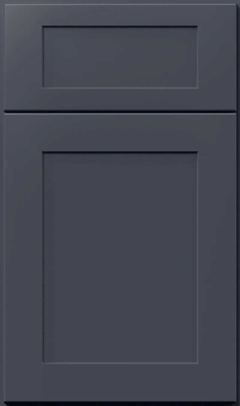
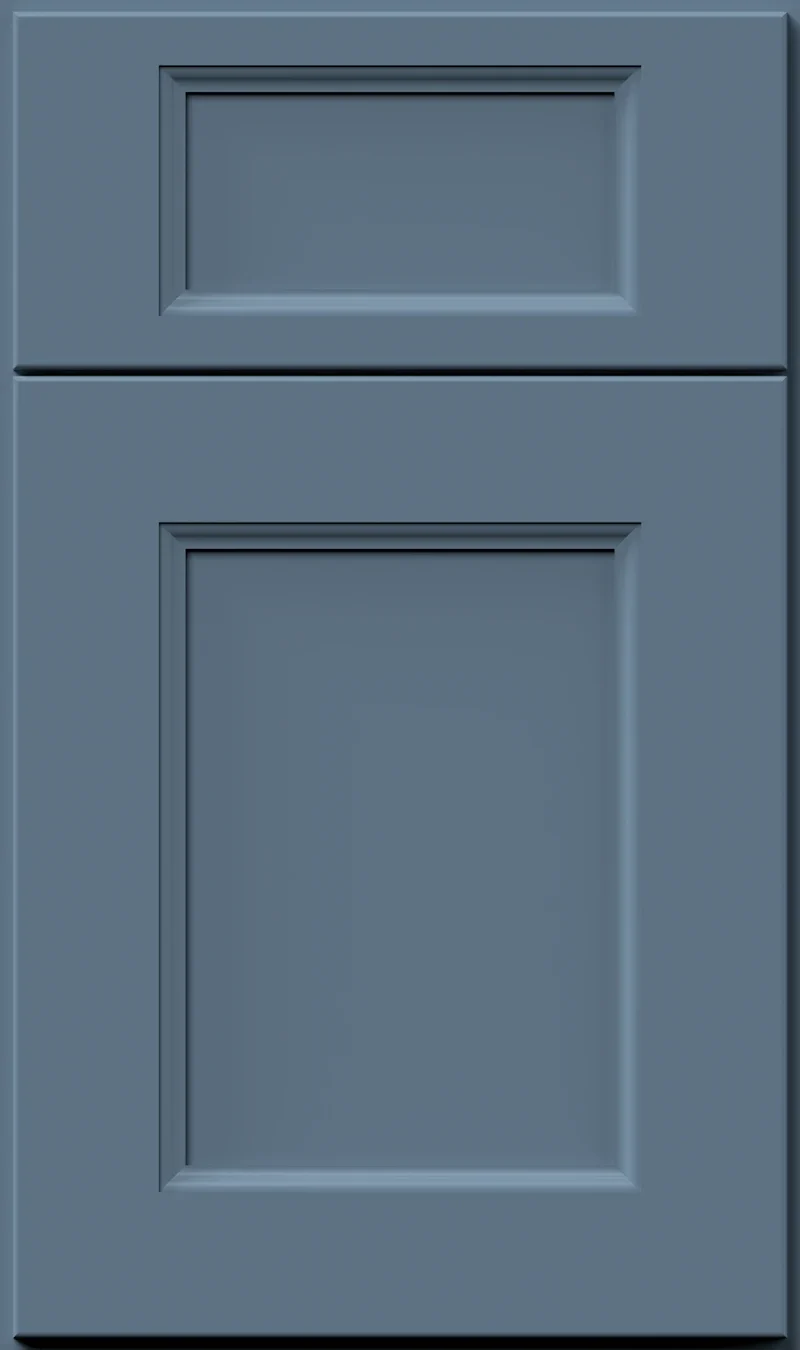
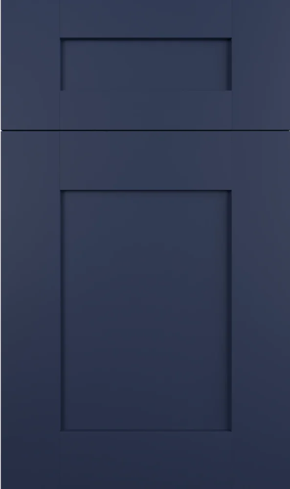
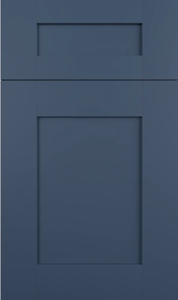
The value here is genuinely dark, but the color is not saturated. Gray runs all the way through it, and the hue sits a step toward teal from the middle of blue, so there is a faint green cast in strong light. That combination gives you a deep blue that never looks bright. The chip is a smooth, even paint film with no wood texture coming through — the color is uniform from edge to edge.
In a north-facing kitchen Maritime goes cool and slatey and can read almost like a dark storm gray. Direct south light is where the teal shows: the green in it lifts and the color looks warmer and more alive. Under warm evening bulbs it gives up most of its blue and becomes a soft near-black. This is a color worth seeing on a cloudy day, because that is its least flattering condition and the one most kitchens spend a lot of hours in.
Navy is the usual guess, and the difference matters. Kemper’s Naval is cleaner and far more saturated, a blue that stays blue. Maritime is dustier and carries that slight green lean, which makes it easier to pair with warm woods and cream. Set next to Regatta, which is nearly black, Maritime looks distinctly blue-gray and a great deal lighter. If your plan is a dark kitchen that still feels soft, this is usually the one we point to.
Construction & Quality
Kemper has been making cabinetry in America since 1926 and is part of the MasterBrand family. Offered in the Kemper Emerge series.
Emerge is Kemper’s most personalized series: all-plywood construction, custom sizing, and a choice of full-overlay, inset or beaded-inset doors, with specialty finishes, stain and glaze options and multiple edge profiles.
Kemper backs its cabinetry with a limited lifetime warranty; coverage and terms are set by Kemper.
Where It Works
A dark color on every cabinet in the room asks for light to carry it. In a kitchen with good window area and a bright counter, full-height Maritime is a handsome, settled look, particularly in a transitional or traditional room. In an average-light kitchen we would put it on the base cabinets, the island and a hood surround, and keep the uppers white or cream. It also does well across a full wall of tall cabinets flanking a range.
Outside the kitchen it is a strong choice for a butler’s pantry or a bar, where a deeper color makes the space feel like a room of its own. A powder room can take it on the vanity without trouble; small rooms tolerate dark cabinets far better than people expect, because the eye reads the whole room rather than the cabinet alone. Mudroom lockers in Maritime hide everyday marks well.
Pairing Ideas
Countertops
Cream-toned quartz suits it better than a bright white, because the slight teal in the blue plays nicely against warm cream. Cambria Crowndale and Cambria Kentmere, both cream quartz, keep the contrast gentle. If you want the counter to snap, Vicostone Bendecio or Cambria Ainsley, both near-solid bright whites, do it cleanly without adding pattern.
Countertops we carry →Backsplash
Against dark cabinets the backsplash carries the brightness. MSI Statuarietto Bianco, a white porcelain, gives a clear lift. For something warmer, MSI Porcelain Tile Elbe Sand or MSI UrbanSlat Blonde 16x48, both cream, echo the warm side of the blue. A gray tile such as MSI Porcelain Tile Gris Loft keeps the palette tonal and cool.
Backsplash tile →Hardware
Warm metals show best on Maritime. The Berenson Swagger 96mm Modern Brushed Gold Pull reads clearly against the dark blue, and the Berenson 128mm Champagne Bar Pull does the same in a softer key. Matte black nearly disappears on a color this deep, which some people want and others regret. Vintage nickel is the restrained middle ground.
Pulls & knobs →Floors
Warm and mid-toned is the safe direction. Oak in engineered or solid hardwood, somewhere between honey and light brown, keeps a dark kitchen from feeling bottom-heavy. A very dark floor under dark base cabinets erases the line between them. If you are tiling, a warm cream porcelain does the same job as a light wood floor.
Flooring →Frequently Asked Questions








Plan a Kitchen in Maritime
Tell us about your room and we will help you decide whether Maritime is the right call, then design, order and install it.
Or call: (630) 733-7700