

Kemper · Paint
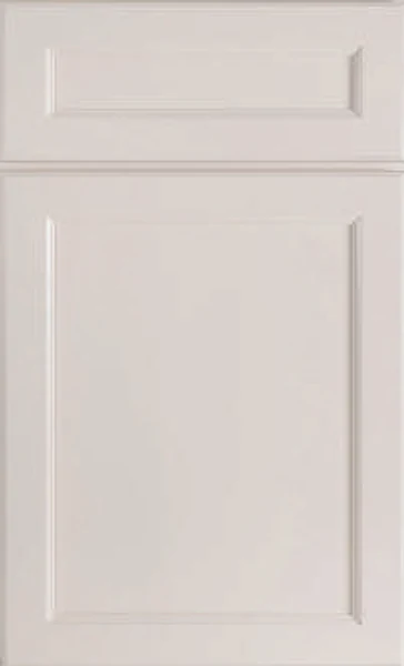
Kemper Coconut Kitchen Cabinets
Offered in the Kemper Echo, Choice and Emerge series
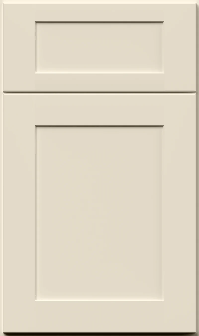
Warm, soft and unmistakably creamy, Coconut sits at the golden end of Kemper’s off-whites. It never pretends to be a white; there is real butter in it, more than you see in Steam or Westhighland White. It suits kitchens with wood tones, warm stone or plenty of afternoon sun coming through.
- Brand
- Kemper
- Finish
- Paint
- Availability
- Made to order
Color & Look
Its value sits close to that of Steam, but the hue is a good deal more golden and the saturation is noticeably higher, which is why the two look nothing alike in person. The result is a cream with body, warm enough to register immediately and light enough to keep a room bright. The chip is flat and smooth, with no glaze, flecking or grain, and the sheen is low enough that large door faces read evenly.
North-facing kitchens are the strongest argument for it. Cool northern light pulls warmth out of a room and Coconut has plenty to spare, so it lands as a comfortable, well-lit cream rather than going gray the way a cooler off-white can. In a south or west kitchen, be aware that afternoon sun amplifies the yellow, and in full summer light on a large run of cabinets it can read closer to butter than to cream.
The usual confusion is with an antique or glazed cream, since the warmth is similar, but this is a plain painted finish with no glaze in the profile and no variation from door to door. Against Kemper’s Westhighland White the difference is temperature, because Westhighland carries a green-yellow parchment note while Coconut is straightforwardly golden. Against a bright white it looks like a color rather than a shade of white.
Construction & Quality
Kemper has been making cabinetry in America since 1926 and is part of the MasterBrand family. Offered in the Kemper Echo, Choice and Emerge series.
Emerge is Kemper’s most personalized series: all-plywood construction, custom sizing, and a choice of full-overlay, inset or beaded-inset doors, with specialty finishes, stain and glaze options and multiple edge profiles.
Kemper backs its cabinetry with a limited lifetime warranty; coverage and terms are set by Kemper.
Where It Works
A whole kitchen in Coconut is a warm, forgiving scheme, and it is one of the better answers when an older house has honey-toned floors or trim that nobody plans to change. It also pairs well as the upper-cabinet color over a deeper island or lower run. In a small kitchen it stays bright enough to work, and in a dark kitchen it is more sympathetic than a cool off-white, which can go dingy in that light.
It reads traditional and farmhouse most naturally, and it holds up in transitional rooms with simple shaker doors, but it is not the color for a cool, minimal scheme. Away from the kitchen it suits a bath vanity in a warm-toned house, a bar or butler’s pantry, and library shelving, where it sits kindly against book spines and stained wood without the contrast a stark white creates.
Pairing Ideas
Countertops
Cambria Brittanicca Warm and Cambria Skara Brae, both cream quartz with marble-look veining, stay at the same temperature and give the room movement. Cambria Warwick in cream is the plainer version of that idea. If you want the counter to read clearly brighter, Cambria Sutherland or Cambria Oakleigh in bright white make the cabinets look warmer by comparison.
Countertops we carry →Backsplash
MSI Calacatta Matte 2x2 Hexagon Mosaic in cream is the tonal match and keeps the wall soft. MSI Dymo Statuary Chex White or MSI Bianco Dolomite Pinwheel Geometric in white mosaic brighten it and give the golden doors a crisper edge. MSI Dorado Pebble Tumbled adds texture, which suits a farmhouse scheme better than a flat tile does.
Backsplash tile →Hardware
Warm metals are the natural fit. Champagne, in the Berenson 128mm Champagne Bar Pull, and the Berenson Swagger 96mm Modern Brushed Gold Pull both sit comfortably in the same golden family. Bronze suits a traditional door. If you want to cool the room down, vintage nickel is a better bet than chrome, which can look harsh beside a cream this warm.
Pulls & knobs →Floors
Be careful here, because a honey-toned oak floor plus a golden cream cabinet is a lot of the same note. Either go deeper, with a mid-brown or walnut-toned hardwood, or cooler, with a grayed white oak, so the two surfaces separate. Porcelain tile in a limestone look gives a neutral break underfoot, and LVP in a low-warmth oak does the same job.
Flooring →Frequently Asked Questions







Plan a Kitchen in Coconut
Tell us about your room and we will help you decide whether Coconut is the right call, then design, order and install it.
Or call: (630) 733-7700