
2026 Kitchen Trends: What's Worth Your Money, and What's Already Fading
Every January, the internet hands you a fresh list of kitchen trends and tells you your kitchen is suddenly out of date. It's a great way to sell magazines. It's a terrible way to plan a room you'll live in for the next fifteen years.
We build these kitchens for a living here in Wheaton, so we get to watch trends up close — which ones people still love two years later, and which ones they quietly wish they'd skipped. So instead of just listing what's “in” for 2026, here's the honest version: what's actually worth your money, what to handle with care, and what's already on its way out.
A quick ground rule before we start: a kitchen is not a phone case. You don't get to swap it every eighteen months when the mood shifts. The trends worth chasing are the ones that still feel right long after the algorithm has moved on.
Warm, earthy tones are back — and the all-white kitchen is cooling off
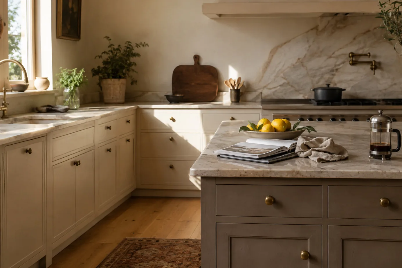
The biggest shift heading into 2026 is temperature. Cool grays and stark whites are stepping aside for warmer, earthier tones: creamy whites, mushroom, greige, soft sand, and nature-y colors like olive, clay, and caramel.
White kitchens had a good, long run — the design equivalent of a band that sold out stadiums for a decade. They're not breaking up, and a crisp white kitchen is still a beautiful, safe choice. They've just stopped being the only act in town. Warm neutrals give you almost the same timelessness with a lot more soul, and they hide everyday life — fingerprints, crumbs, a busy morning — far more gracefully than a bright white ever did.
The verdict: Worth it. Warm neutrals are as safe as white used to be, and they'll age better. If you love white, keep it — just warm it up a half-step.
Deep, dramatic color — in the right dose
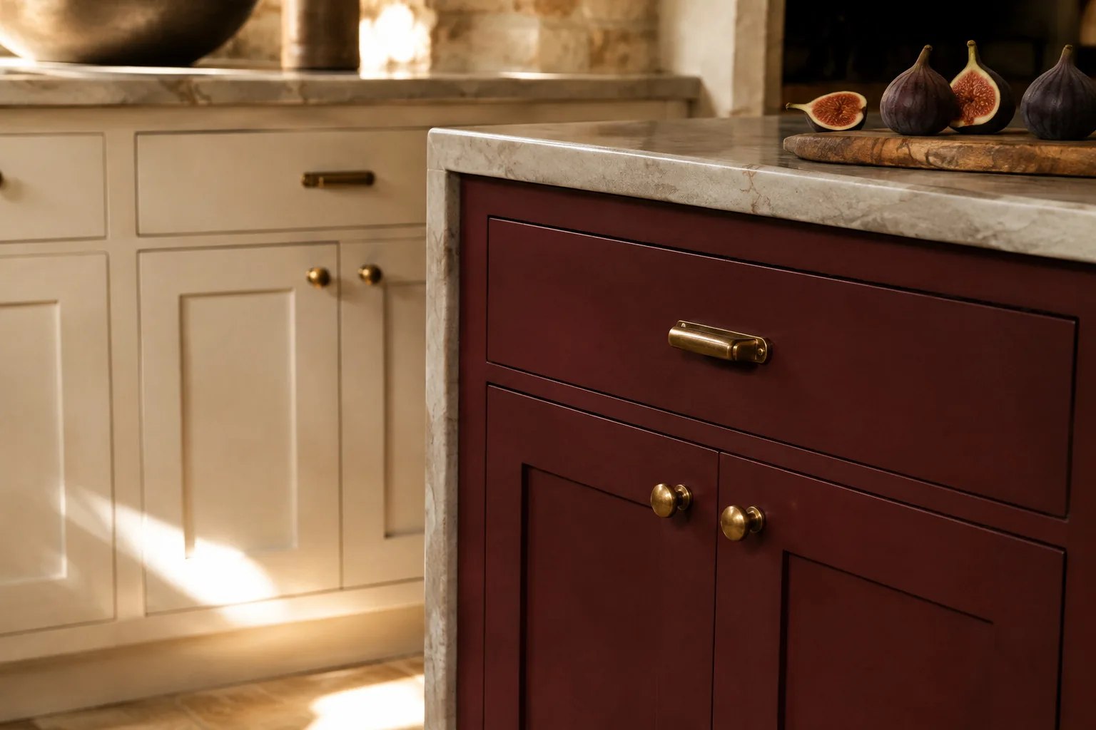
On the other end of the spectrum, bold color is having a real moment: forest and olive greens, smoky and muted navies, and even deep reds like burgundy and oxblood showing up on islands and lower cabinets.
Done right, a deep color reads rich and confident. The key word is dose. A forest-green island against warm, light perimeter cabinets looks custom and expensive. That same green wrapped around every wall of a small, north-facing kitchen can feel like you're cooking inside a jewelry box — and not in the fun way. Color is easiest to love when it has room to breathe.
The verdict: Worth it, carefully. Put the drama where it can be a feature, not the whole story — an island, a run of lowers, a pantry wall. Let the rest of the room stay calm.
Two-tone kitchens — the one worth getting right
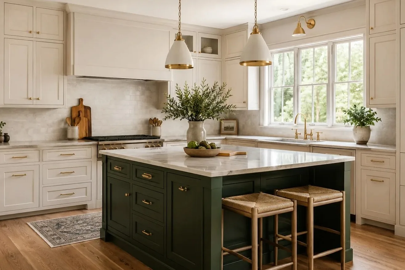
Two-tone is officially everywhere for 2026: a lighter color up top, a deeper color on the lowers or the island. We do a lot of these, and here's the honest truth about them — done well, two-tone looks custom and considered. Done badly, it looks like two kitchens got into an argument and neither one won.
The difference isn't luck. It's a few rules:
Pick a dominant color and an accent — roughly seventy-thirty, not a fifty-fifty split. When the two colors get equal billing, your eye doesn't know where to land and the whole room feels restless. One color should lead; the other should punctuate.
Keep the darker color low. Put it on the island or the base cabinets, and let the uppers stay light. That grounds the room and keeps it feeling open. Flip it — dark on top — and you've just lowered your ceiling and dimmed your kitchen.
Share an undertone. Both colors warm, or both cool. A warm cream fighting a cold gray makes both of them look a little dirty. A warm cream beside a warm olive? Instant harmony.
And finally, let something bridge the two — the countertop, the backsplash, the flooring, and especially the hardware. Those are the glue that turns two colors into one design instead of two things sitting next to each other.
A few combinations worth stealing
Because everyone defaults to blue-and-white, and you can do so much better.
- Warm olive-sage + soft mushroom — for a tonal, earthy calm.
- Forest green + natural white oak — the wood keeps the green from feeling heavy.
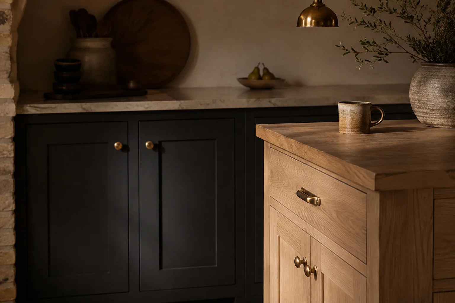
- Charcoal + white oak — if you want moody but still warm.
- Oxblood + oatmeal cream — for a little quiet drama.
- Terracotta + limestone — for Mediterranean warmth.
The common thread in every one: shared undertones, and the darker color kept low.
The verdict: Worth it — and worth doing with someone who's done it before. The rules are simple, but the margin between “custom” and “clashing” is narrower than people expect.
Texture and fluted panels — proceed with caution
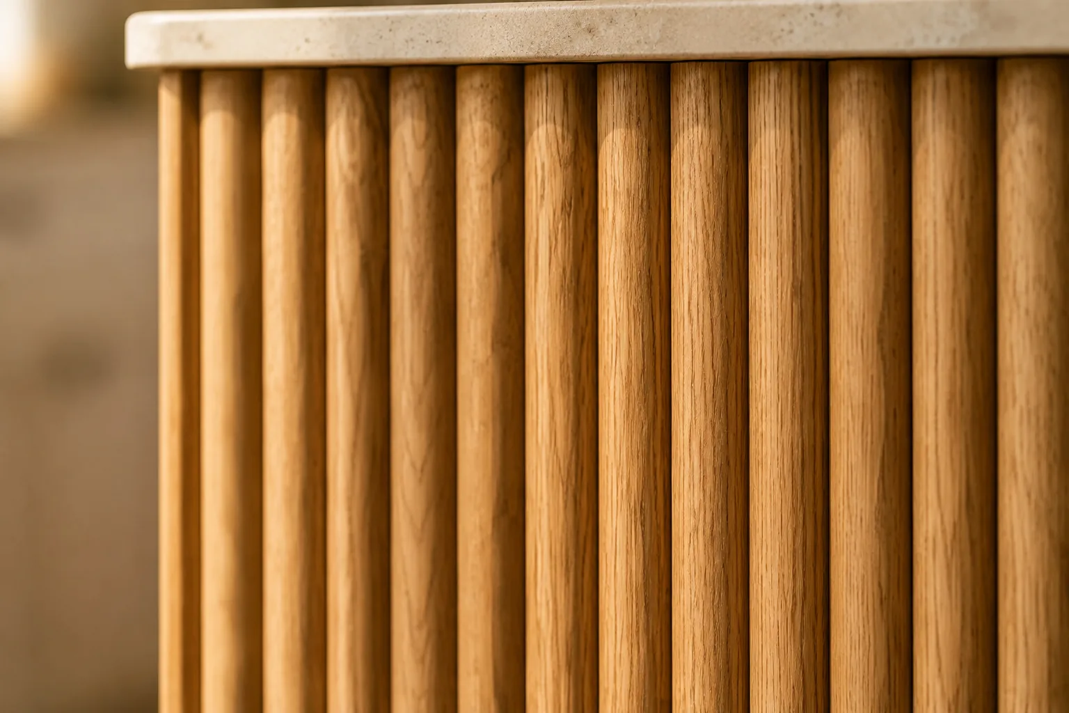
If color is the big story, texture is the runner-up. Matte finishes are now basically the default, and fluted (or “reeded”) panels — those vertical, ribbed wood details — are the graphic detail of the moment, showing up on islands, hoods, and accent walls.
Here's the honest note, though: fluting went from “ooh, interesting” to “oh, this again” faster than almost any detail we can remember, and some designers are already calling it overdone. Texture itself isn't going anywhere — it adds warmth and depth that a flat painted door can't. But a fully fluted kitchen is going to feel very 2026 in about, oh, 2029.
The verdict: Great as an accent, risky as the whole look. Use fluting where it earns its place — an island face, a single wall, a hood — and let it be a nice detail rather than the entire personality of the room. (This is exactly where a fluted or slat wall panel shines, by the way: one wall of texture does more than an entire fluted kitchen ever will.)
The hardware glow-up — the easiest win in the room
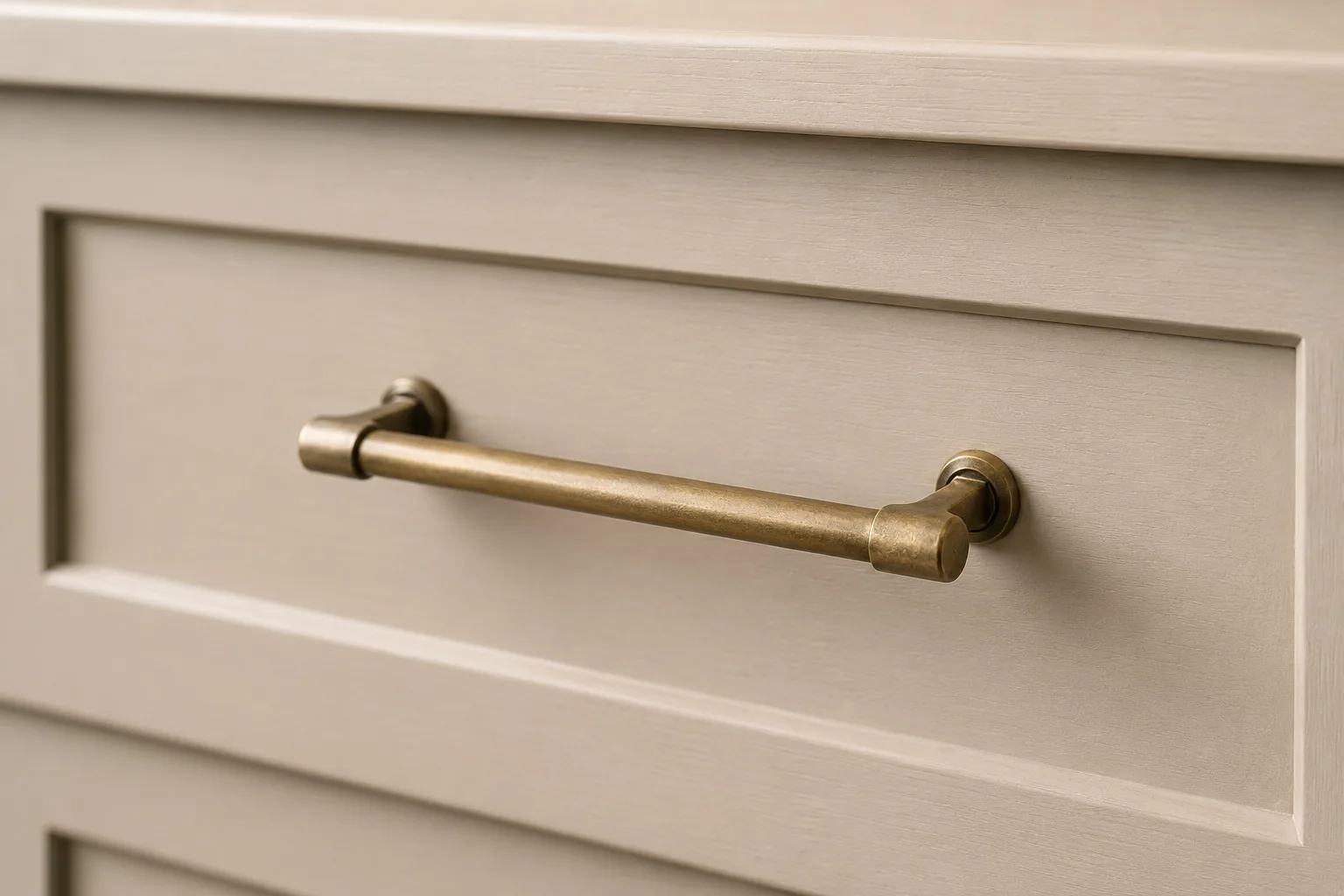
Cabinet hardware is quietly getting a promotion. Polished chrome is on the way out; aged brass, oil-rubbed bronze, and brushed metals are in, bringing a warmer, more grown-up kind of elegance.
We love this one, and not just because we keep a wall of pulls and knobs in the showroom. Hardware is the jewelry of the kitchen — it's the cheapest thing in the room, and it changes the whole feel. Swapping shiny chrome for warm brass is the closest thing to a magic trick in cabinetry: small money, big difference.
The verdict: Worth it, every time. If you do one thing on this list, do this one.
Smart cabinet details — where they actually earn their keep
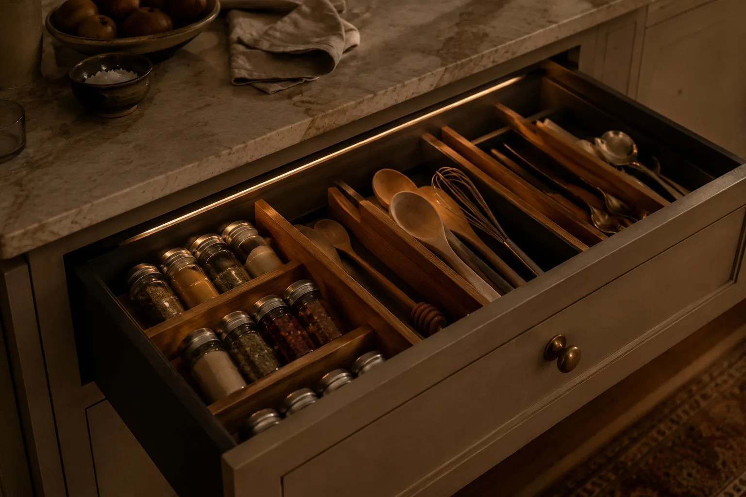
Cabinets are getting quietly clever: drawers with built-in charging, sensor lighting that flicks on when you open a cabinet, and interior organizers that finally give everything a home.
Some of these are genuinely wonderful. Sensor-lit drawers and a well-designed interior are the kind of thing you use every single day and never stop appreciating. Others are a solution in search of a problem — a drawer that charges your phone is great; a cabinet that needs a software update is a conversation we're not ready to have.
The verdict: Worth it where it earns its keep. Spend on the smart features you'll actually touch daily — lighting and organization — and be a little skeptical of the gadgets.
And what's quietly fading
A few things are aging out. The stark, all-cool-white kitchen is losing ground to those warmer neutrals. High-gloss everything is giving way to matte and satin. And — say it with us — wall-to-wall fluting is going to date fast. None of these are wrong; they're just no longer the fresh choice they were a couple of years ago.
So what should you actually do?
Here's the thing no trend list will tell you: the best kitchen isn't the most on-trend one. It's the one that fits your home, your light, and how you actually live — built on timeless bones, with a few current touches you genuinely love.
Chase the trends that still feel like you after the excitement wears off. Warm it up, ground it with a good two-tone, put the drama where it belongs, and spend your hardware budget freely. Skip whatever you're only doing because the internet told you to.
If you want a second opinion from people who see these choices play out over years — not just seasons — come see us. Stop by our Wheaton showroom or book a free consultation, and we'll help you sort the trends worth keeping from the ones you'll be painting over in three years.
Sort the trends worth keeping
A second opinion from people who watch these choices play out over years, not seasons. No pressure, no obligation.
Book a Free Consultation